Friday, 18 April 2014

Your Undivided Attention - Part One

Hello everyone, Lisa-Jane here today!

Lots of manufacturers now are making wonderful collections aimed at people using pocket page protectors, as well as the various designs of divided page protectors themselves. Previously paper collections might have had one sheet that was designed to be cut apart but the reverse of that sheet was often a solid colour so you got the best of both worlds.  

Now though, with so many people using these divided page protectors, the reverse of the pre-designed sheets are often intended to be cut apart too. That's fine if you have that particular design of protector but what if you don't? Or, what if, like me, you love a collection but you just want to use it on standard 12x12 pages? Do we end up missing out because we don't want to use undivided protectors? I don't think so! 


In the next 3 posts I'm going to show you some designs I've made using the Simple Stories Homespun Collection which coordinates with the Simple Stories albums and protectors. However my projects in the first 2 posts fit my normal American Crafts D rings albums and protectors and the final 2 projects are "off the page" style.

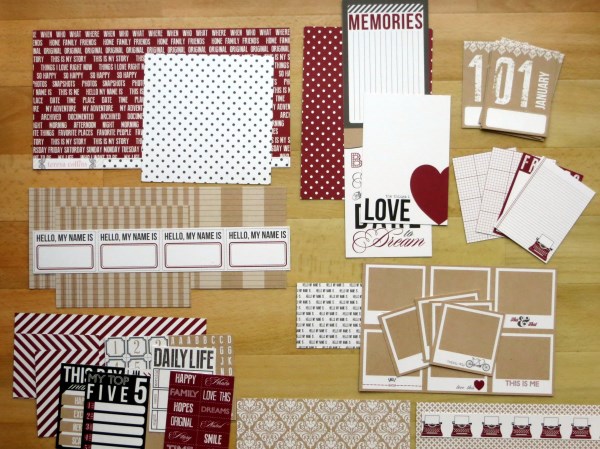
Firstly I went through and cut all the sheets into their relevant sections. As I was cutting, some of the items were jumping out at me as needing to be used at their intended size and others I knew I would be happy to use in another way. This second pile that I set aside could be used for die cutting, fussy cutting, punching shapes, layering edges etc. I also took off all the branding strips and cut off the information so I was left with just the usable pieces. Making these decisions early and assembling a "kit" in this way meant that I knew exactly what I had available and also that I didn't wobble when I wanted to cut a small piece of something!

Family:


For this first layout I used one of the pieces of 12x6 as a panel just in from the left hand side. These large panels often have something you can choose to use as a title too so an alternative could have been cutting the panel along the second "plank" from the bottom. I wanted to use it in its entirety here though as I think it makes a natural home for the photo above right.

I also cut one of the 6x4 cards to make a second mat for my photo... 


I really liked the pattern and I knew I wasn't going to use the sentiment but my photo was already matted onto another 6x4 piece so I needed to do some creative patchwork!

 I cut an L shape and then adhered the piece with a small gap, then adhered the photo on top. I chose a 3x4 card from the pile I had set aside for cutting up and punched a couple of pinked circles for layering.


 The branding strips make great banners and are perfect for disguising small gaps and joins. I added some texture with stickers, chipboards and brads from the collection.  


I added the coordinating banner sticker on pop dots and I love the way it mirrors the banner on the wood grain panel.


My second layout was completed on a piece of A4 cardstock. I use the standard office page protectors for this size as they still perfectly fit the AC ring binders and add a bit of variety to the album.

Elliot:


Here I've cut down a photo to 3x4 and made a grid from 3 other 3x4 cards that I really liked. Two of the cards are decorative and the third is for journaling. I adhered them to a piece of the cardstock that I cut from the centre of the background to make a narrow frame for the grid. This helps the eye to see the grid as one whole piece and also lifts it slightly from the busier background.

I added texture and dimension with buttons, twine, bobble trim and a couple of branding strips. I also added to the printed embellishments using chipboard stickers:


The little label area on this card was a perfect home for my great nephew's name and the red alphas in the set worked perfectly with the reds I was bringing out in my colour scheme.

So lets recap - so far we've used a 6x12 panel as it is, incorporated it as a title, made photo mats with 6x4 cards, made a grid with 3x4 cards, used a 3x4 card for a journalling block and used "spare" cards and branding strips for punching shapes and making embellishments. 

Wow! Who said you could only use this collection with divided page protectors? 

And there are still 2 posts to go in this series! Join me again soon!

Lisa-Jane x

P.S. Are you loving Simple Stories right now? Check out the other Simple Stories collections in stock at SJ Crafts HERE!

Lisa-Jane shares lots of crafty creations and regularly joins in with 'What's On Your Workdesk Wednesday' over on her blog 'Inside My Head'!

Monday, 14 April 2014

Using Stickers For Starting Points!

Hello, it's Louise here today. Welcome to SJ Crafts.

Last month I used Amy Tangerines Plus One collection to create these layouts. Today I'm here to share with you another two layouts and some greeting cards using the same collection. This time my focus is on the Amy Tangerine's sticker sheet.


How many of us are guilty of buying collection kits that include a 12x12 sticker sheet? You know the sheets I mean, the ones that usually include an alpha set and word stickers.

I am definitely guilty of this, even when I purchase a few sheets of 12x12 paper or a small 6x6 paper pad I check to see if there is a sticker sheet to accompany them! 

It's safe to say that I have quite a selection of these 12x12 sticker sheets and most of them look very similar to this one.....


.....half used with stickers cut out, where I have placed them onto a project to see what they look like without sticking them down straight away.

Instead of putting this half used sticker sheet away with all the others I challenged myself to create a couple more layouts using a sticker as a starting point. Well, Amy Tangerine has designed a fun collection, it would be a shame not use all those stickers, wouldn't it?!

On the right hand side of the used sticker sheet I shared with you above, you will see where a long pink sticker sat. When I decided to use a sticker as a starting point I adhered this sticker to a sheet of 12x12 cardstock before I thought to take a photograph. From the whole sheet this is the one sticker that jumped out a me shouting "use me, use me", so after placing it on the cardstock I put it to one side knowing I would need to locate the photo I wanted to use.


In the meantime I selected a few more stickers that I knew would work with the second photo I'd chosen to scrap. I mixed the 12x12 sticker sheet with some of Amy Tangerine's puffy stickers. The large sticker "an everyday kind of adventure" was the sticker I'd chosen to base my layout around:


I started out with a sheet of white cardstock (it seems to be my "go to" supply at the moment), my photo and my adventure sticker. Placing the stickers and some Amy Tangerine cards from the 6x6 pad I started to build up my page:


This photo of me was taken on top of an open air bus on a tour of Liverpool city. There I was, in my element, taking lots of photos and in true British Style, the heavens opened. We had to move downstairs and as it continued to pour with rain, more people squeezed onto the bus, the windows steamed up and bang went my sightseeing photo taking tour :). This fun sticker collection included an Umbrella too. Just perfect.

Not only did I use a sticker to base my layout around, I used the alpha stickers and Amy Tangerine's Cards from the 6x6 paper pad to create my title....

My happy place is behind this camera.
 
Sunday Morning Routine

Remember the big long pink sticker from above....by now I'd located the photo that I'd had in mind to scrap with this sticker. A rugby photo no less. One where the funky socks would work well with the funky stickers, and one where this sticker would record our Sunday Morning Routine.

Really, this sticker I could have used again and again. It's a perfect sticker to use to record so many everyday things.

The sticker was used to create the title for my layout.


More Amy Tangerine stickers from the above sheet were used along with an Amy Tangerine badge and bradstudio calico stars and Mister Huey Mists.

As I went to photograph my layouts I moved my corner rounder across my desk and done something I haven't done in a long while. I corner rounded my layouts. I'd forgotten how much I like the look.

Cards

After completing the layouts I took another look at what was left on my sticker sheet and decided to make some cards using papers from Amy Tangerine's 6x6 paper pad and some of the remaining stickers.


First up is the Typewriter sticker. I trimmed down a sheet of 6x6 patterned paper from Amy Tangerine's pad and inserted side panels. The patterned paper is rather busy so the plain grey side panels tone it down a little. 


To add some texture I ran the paper through my sewing machine. It is a good idea to sew your paper before you stick it to your card. That way the stitching will not show on the inside of your card.


Adding a little stamped text, a badge and the typewriter sticker, there is a little card on it's way to a lovely recipient.

The world globe was the next sticker left on the sheet that I wanted to use. I took three patterned papers from the paper pad to layer and stitch.
The small grey hello sticker and alphas together made a greeting.  I added the globe, a few stars and twine and I have a card that I love.


Did you spot the teeny cloud on the above sticker sheet? Half way up on the right hand side under the orange umbrella! I wanted to use it and noticed that Amy Tangerines puffy stickers also had a teeny puffy cloud. Picking out three patterned papers again, I went for the house paper and layered and stitched along the top of the layered papers to add design and texture. With a few gems and the puffy house sticker I finished my card.


It feels good to have used up most of my sticker sheet. Amy Tangerine's stickers are inspiring and fun to use. I enjoyed using them so much that I'm now going to pop across to SJ Crafts shop to see what collection and sticker sheet I will purchase next.

So...   
  •  are any of you are going to admit to having lots of these half used sticker sheets? 
  • how many of you are now thinking you could use these stickers on your next project?
  • are you thinking about including a sticker sheet next time you shop for supplies? 

Please do leave us a comment and let us know.
Thank you for stopping by, have a lovely day! 

Louise x

To see more of Louise's inspiring craft projects check out her blog Boys, Bugs and Beautiful Buttons!

Friday, 11 April 2014

Easter Card & Egg Holder!

Hello everyone, Jenny here today!


I have a quick and easy Easter project to show you, I made both the card and the egg holder from 1 sheet of Kraft card, with 1 sheet of 6 x 6 paper as the main decoration!


The card is 10 x 10 cm which was cut from the sheet of Kraft card. The paper is from MME Now & Then Mildred pad. I simply cut a strip from a sheet mounted it onto pale yellow paper and stuck it down the centre of my card blank. I coloured a cute Easter image from Pink Petticoat and mounted it on a die cut yellow scalloped circle which is then stuck to the card on foam pads to give it some dimension. 

I added some Studio Calico wood grain enamel dots to the corners and also in the centre of the flower on the top of the egg. Lastly I used Glossy Accents to make the chicks beak shiny.

Onto the egg holder I cut a piece of Kraft card 27 x 9 cm and then scored 11 cm, 17 cm, 19 cm and 25 cm. I made up a template below if you want to use it! Between the score lines at 19 cm and 25 cm I die cut a circle for my egg to sit into:


 Once folded up you can see you have almost a box shape with a flat back. I decorated the back similar to my card adding a strip of paper with die cut image attached. I also added a strip of paper and some enamel dots to the front of the box.

Here's the template:


I hope you have enjoyed my projects today, you can give them so someone this Easter for a really sweet gift!


Jenny is a busy mum of three who makes lovely cards and other projects and shares them at her blog Dragonllew's Spot!

Friday, 4 April 2014

Cutting Into A Collection!

Hello everyone, Jemma here today!

Are you a photo-first scrapper? Someone who selects a photo and then chooses just the right papers, cardstock and embellishments to showcase it? Or do you see a paper collection for sale and fall in love with the colours, textures and ephemera, hoping that the perfect photos can be located in your to-scrap pile?

I'm generally in the latter category, partly because there are no bricks & mortar scrapbook shops nearby, meaning that I generally shop online, and partly because I have years of photos to scrap with so it's easier to start with stash that I want to play with.

However making that first cut in the first sheet of paper of a kit or collection is always a little tricky:
Which side of a double-sided sheet should I use?
Would those stripes be better cut vertically or horizontally?
What if the next page's photos needed this paper design?
What if I run out of a favourite pattern?
Here's a look at my Seven Step Process for cutting into a collection; specifically what I did with the Teresa Collins' My Name Is Collection.

Step One - Look at the Collection

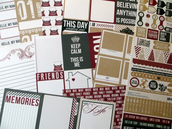
First of all I emptied out all the papers and thought about the sorts of pages I might use them for. Highlights from the A sides included:
• a whole sheet of monthly 3x4 cards for a year-long project
• lots more 4x6 and 3x4 cards with quotes and phrases or space for journalling
• a sheet of 16 fun kraft polaroid frames
• a sheet of words and phrases that could be cut into strips
Teresa Collinns - Hello My Name Is - S J Crafts

Flipping the sheets over, I discovered that there were some versatile background patterns amongst the B sides and realised that I would have to choose which 4x6 or 3x4 cards I definitely wanted to use before cutting up any sheets at all.

Teresa Collinns - Hello My Name Is - S J Crafts

Teresa Collinns - Hello My Name Is - Months - S J Crafts
Step Two - Reserve "Special Sheets"


I'm not a pocket page scrapper but I do like to scrap monthly summaries each year so my first job was to cut up the sheet of calendar cards for this year's album. I'll use these with scraps from the other papers and some of the left-over 4x6 and 3x4 journalling cards. I'm full of admiration for the designer at Teresa Collins - if I had been using divided page protectors the designs are intact on both sides after cutting.

Step Three - Grab Some Photos

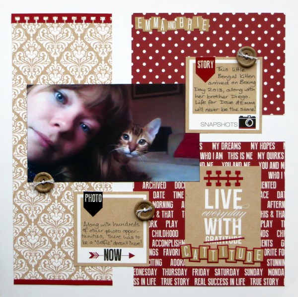
I had two (sets of) photos in mind for these papers by now: a selfie of my son's girlfriend plus kitten, and a set of photos from a visit to a match museum last summer.

Step Four - Extract/Discard Journal Cards

I cut the 'Polaroids' sheet to release my favourites (the B side pattern didn't need any special consideration) and chose 3x4 cards from 'Record' that would work with the photos.  I knew I would never, ever use one of the 4x6 cards from 'Love' ("Don't Forget You Are Awesome") so it was an easy decision to cut it free and use the B side instead.

Teresa Collinns - Hello My Name Is - Polaroids, Record, Love - S J Crafts
Polaroids                        Record                           Love


Step Five - Start Cutting, Shuffling, Sticking

I decided that I would never use the A side of 'Journal' and therefore paid it no attention when cutting the sheet up. Some paper & card shuffling took place before I decided to add a block from the 'Words' paper to to align with the back of the 4x6 card, again paying no heed to the B side as it was a uniform pattern:

Jimjams - Cattitude - for S J Crafts

Teresa Collinns - Hello My Name Is - Noted - S J Crafts
The second set of photos needed a double layout, plenty of "white" space and non-intrusive patterns.  Along with another 'Polaroid' frame, and a 3x4 card from 'Record', I cut two horizontal strips from 'Noted' to stretch across the entire width of my sheets for continuity. Having used/reserved a number of the 3x4 cards from 'Record' I had to be creative with the remainder of the B side and lay short strips of the graph paper just under the photos. It was a real jigsaw!


At this point I did make a mistake and tried to use strips of the kraft ledger paper from 'Tag's before deciding that I hated it and replacing it with strips of red cardstock. No matter though - I need scraps for my monthly pages!


Step Six - See What's Left

OK so that was a single and a double page done and all but one sheet of paper ('Lucky') cut into ... so I cut it up to stop myself being too precious with it!

Teresa Collinns - Hello My Name Is - S J Crafts

Step Seven - Go Back to Step Three & Repeat

Time to take stock and start thinking about the next pages ... my yearly album needs some of those reserved polaroids, journalling cards and scraps, but I'm sure that there's at least one more 12x12 to come ... I'll be back!

Are you tempted to cut into a collection? SJ Crafts stocks a wide range of Collection Kits to play with, check them out!

Jemma x

Jemma blogs at Just Jimjams where she recently celebrate her 400th post, pop over there for more inspiration!