Showing posts with label Design Team. Show all posts

Saturday 9 August 2014

August Challenge - A theme and Stash Challenge!

Hello!!
Where did July go? I can't believe it's August already!!
So, time for a new Monthly Challenge!

Thank you to everyone who played along with July's challenge. There were some lovely entries and I'll be back soon with some of my favourites and also a few favourites from June's challenge too (as I've realised I've not done those yet!) and of course the winners of the prizes (chosen at random) for both challenges.

The August Challenge is a "Theme and Supplies Challenge"

I would like to see projects on the theme: HOLIDAYS AND/OR TRAVEL AND USE "SOMETHING OLD & SOMETHING NEW" on your project.


So, break open that brand new pack of embellishments that's been on your craft desk for a while or get that new stamp that's not yet been inked up and use it ..... and have a good rummage through your crafty stash for something old - something you've had for ages. Have you been saving something for just the right layout? Well, go get it and use it!!

As usual, there's some samples from the Design Team


Sarah (Me)

Another page from our Ibiza holiday from a few years ago using some new papers and stickers from the Simple Stories "Good Day Sunshine" collection. My older stash includes the washi tape that I've had for a while, the red thickers and some very old Prima e. pearls.


I made some pockets pages from our Florida Holiday. I mixed up some new and old stickers. I'd been hoarding some of these stickers for a very long time and my something new is the simple stories label stickers, to journal on. 


My daughter's friend is leaving the UK to go back to live in Korea so I have made her a card.
My something old is my Fiskars border punch. I think this was one of the first punches I bought and my something new is my Digital stamp which I bought to make this card.


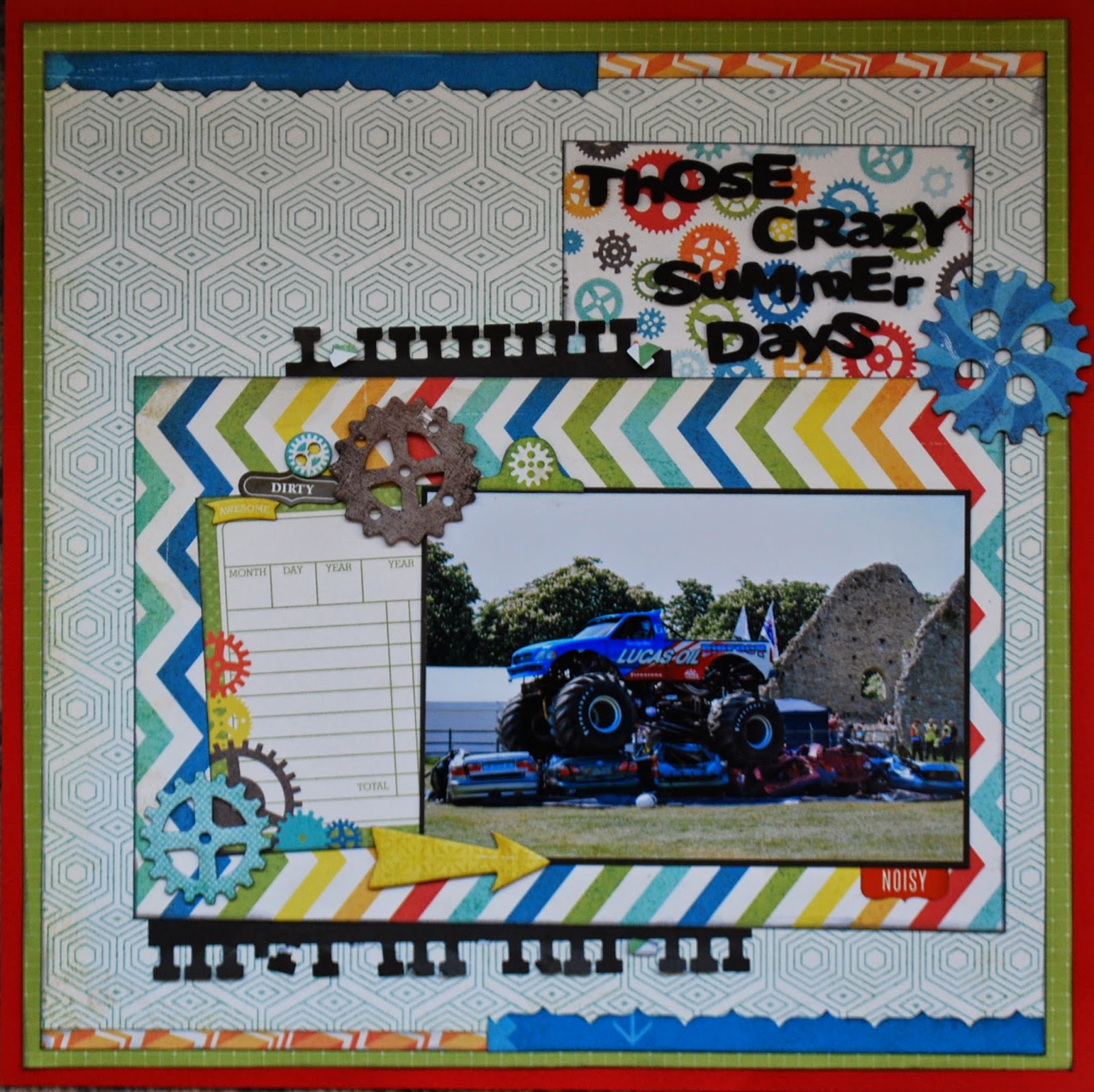
I've used papers from the Crate Paper "Boys Rule" collection which came in a recent SJ Crafts monthly kit, and created an embellishment for my page with some snippets from the Echo Park "Brothers" collection which I've been hoarding for at least a year. I've also dug out some half-used packs of alphas which were lurking in the very bottom of a drawer and mixed them up to create my title. My new stash includes some brand new MME Necessities wooden arrows, a Studio Calico wood veneer camera and the cute cloud washi tape.


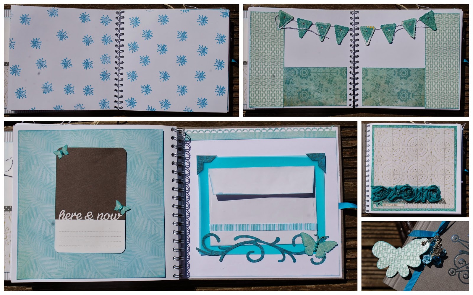
I wanted to make something special for my son's teacher as her end of year gift.  She's getting married soon so I have made her an album for her to keep her honeymoon photos and travel memorabilia in. I've used a complete mixture of papers, some very old and some quite new.  Scattered through the album are some Project Life cards that I purchased just a few weeks ago. These are just a few of the pages. 


I've used some new stash, bought in the recent SJ Crafts sale and mixed it up with much older supplies to make up my latest Counterfeit Kit.

The MME Cut & Paste Charm papers were the right colours & designs for a story about the Duelling Dragons roller-coasters, yet the Basic Grey Marrakech alpha stickers also matched the scales and arrows perfectly.  In fact there's also some very new stash on there ... faux dots made especially for the page from ThermoMorph plastic pellets ... you can't get newer than that!


So are you ready to take up the challenge this month? 

Add your entry to the linky tool below if you want to play along. A link back to this post is much appreciated.

This challenge will close on 6th september at 11.59pm

I look forward to seeing your Holiday or Travel projects using your old and new stash!!

Have fun!

Friday 4 July 2014

July Challenge - 1 Of Five!

Hi and welcome to a New Monthly Challenge!

The July Challenge is called "1 Of FIVE"


The idea for this challenge is that you choose 1 out of the five shapes/symbols to include on your project, 1 of the five phrases as your title or inspiration/theme and 1 of the five colours to include on your project.

The Shapes/symbols are: Butterfly - Banner - Star (or this could be a sun) - arrow - circle.

The Phrases : Summer Days - Right Now - You and Me - Explore - The Story ... 
* You don't need to include the exact phrase but something very similar .... I need to be able to see the link *

Colours: Yellow - Light blue/Aqua - Red - Black - White    
 *Any shade of the colour is fine!*

This month we have some fabulous examples from the Team:


Jemma had fun with an Easter photo from last year and some very ancient stash (the Christina Cole Life Happens paper from 2006).  The page started life with the June sketch by MiniOwner but ended up elsewhere! 

Shapes/symbols: Circles
Phrase : (Here's) the story...
Colours: White and Aqua


Louise used  a photo taken a few weeks ago with Heidi Swapp products
from the April Kit along with the new Heidi Swapp shapes stencils and pink color shine, Tim Holtz stars layering stencil and inks

Shapes/symbols: inked arrows stars and sunburst paper
Phrases : Right Now
Colours: Yellow, Light blue and White


Annie used a photo from back in 1982, when her son was just starting to explore his little world. The design was inspired by a Glitter Girl video and uses 3x4 cut-aparts from the collection, so it will co-ordinate perfectly with a pocket page layout using more photos from around the same time.

Shapes/symbols: Arrows
Phrase : Explore
Colours: Yellow, White, Aqua & pops of Red

Supplies: Simple Stories Homespun Collection Kit and Simple Stories Daily Grind Chipboard Stickers.


Lisa-Jane chose a photo from last summer about a crazy day watching Big Foot.  


Shapes/symbols: Star/Sun (The cogs!)
Phrase : Summer Days
Colours: Red, yellow, white, black and blue (Well done LJ for getting all the colours on her page!) 

Supplies: Echo Park All About A Boy, red cardstock and the rest from stash.

If you click on the name above the image of the layout it will take you to their blog. The team work hard to create their sample so if you could take a minute to pop over to their blogs and leave them a comment I know they would really appreciate it! 

So, are you up for this month's challenge?

Add your entry to the linkt tool below if you want to play along. A link back to this post is much appreciated. 
The challenge will close on 31st July 2014 at 11.59pm

Have fun!

Tuesday 10 June 2014

Choosing Colours or Themes!!

Hi there, it's Lisa-Jane here today to share some layouts with you.  

When I first started scrapping, I used to look for an exact match to the colours in my photos. This can sometimes be tricky if the clothing or the main colours in the photo don't match the papers you happen to have in your stash at that time. Sometimes matching things too precisely can mean the photo actually ends up getting lost. Similar, but not quite the right shade may just  highlight the difference even more. Not to mention searching through a mountain of stash for just the right shade of blue isn't the best use of time for most scrappers!!
So what should we do .... how do we choose colours for our photos? 

Using themed collections is often a better way to go but it is all too easy to fall into the trap of the theme taking over as you pile on the embellishments and the photo and story can get a little forgotten.

Lately, I've been led more by the story or how I feel about the photos for choosing how to scrap them. I'm no longer limited by the colours in my photos in the way I used to be but I try not to be overly themed either, unless it's Christmas or Halloween and then it's a different story entirely!  I certainly feel more free when choosing papers and pictures to use together than I used to.  

For both of these layouts I've used the fabulous, slightly retro Boys Rule collection.

First of all, let's talk about using colour in the photo as a starting point.  

I find one of the best ways is to pick out one or two from your photo(s) that work well together and then add in additional colours if you need to.  It's also often better to use colours that appear in small amounts in the photos so that it doesn't overpower the layout.


For my double page layout about the beach, I've picked out the yellow t-shirt and an orange hat as my main colours. I used yellow as border strips each side of the photos and there's a some yellow just peeping out of each of the embellishment clusters and the alphas are yellow too.  


I picked out a dark orange cardstock to match the shorts and hat and added a few pops of orange in the embellishments.

I could have tried to match the blues in the sky and the sea or the browns in the stones and used that as my main colours but it is the little people in the photos that I want to draw attention to in my layout.  


I've added a few tiny shells to enhance the beach theme without being over the top. Using a mix of both themed and non-themed embellishments helps highlight the story. The children were having so much fun skimming stones. I wanted to get the fun and carefree feeling of the photos across so a little bit of beach and a little bit of retro fun embellies is perfect.


For my next layout, I've turned my photos black and white as I wanted the story behind them to be the main focus.  This page is about me starting my journey with a Personal Trainer and my struggle to get healthy. I knew I wanted a splash of orange because the equipment is orange and including it in the layout reminds me of the equipment.  It doesn't matter that the photos are black and white and don't show the orange paintwork.


 I could have really gone to town with heavily sport or gym themed embellishments but I didn't want to detract from the actual story so  I decided to be more subtle.  I love the retro cassette tape paper so I used a strip of that to remind me of the music that is always blaring.  The tape measure washi tape is a little nod to my size which will hopefully be going down as the journey continues!  The die cut phrases from the ephemera pack are intended for use with little boys but they work with this story so well.


My layout is about the start of my journey and to remind me that this is just the beginning and we have a long way to go.  It doesn't matter what I can't do now or what lays ahead ... what matters is that I have made that all important start.  

I just love that cheeky "Boom" wooden embellishment from the collection!


Do you see that diagonal line across the page of stars - this helps to draw the eye around the photos, over to the title and finally to the journalling.  I used stars for this but other shapes work well too. You could try using circles or hearts in this way.

Boyz Rule is designed with young boys in mind but I've used it for a beach theme and a gym theme! When you are selecting your stash, try to ignore the collection title or the theme the manufacturer has designed for and look carefully at the icons, images and colours in the papers and embelloshments to see how they may work for you. I often use collections for anything other than what the manufacturer intended!

Do you design by colour or theme?  Or do you go for the story first?  What collections have you used for unexpected themes?  

Bye for now
xx

Like the papers LJ used in these layouts? .... They are available to purchase here in the shop!

Lisa-Jane blogs regularly at "Inside My Head" .... her blog is full of family life, scrapbooking, card making and home decor projects!

Monday 2 June 2014

June Challenge - Summer Colours!

Hello and welcome to our June challenge!

Thank you to everyone who took part in our May Challenge. It's great to see so many of you playing along and we loved looking at the entries. I'll be back here soon to announce a few of our favourites and the winner of the prize.

If you haven't seen our challenges, here's a quick recap of how it works. Each month we will set a challenge and we'd love it if you would play along. Each month the challenge will vary - sometimes we'll have a sketch, sometimes a colour palette, a photo inspiration or a "recipe" of stash to use or maybe a technique.

At the end of this post there is "linky tool" for you to link up your challenge entry so we can pop along and see and we will feature a few of our favourite projects next month. 

June's Challenge is a Colour Palette Challenge!


The colours you must use are: 
  * Hot Pink * Tangerine * Cream * Gold *

The "Cream" can be a neutral of your choice!! So you could use Beige, Grey, White etc!

Here's some inspiration from the S J Crafts Design Team ...


Background - Distress Paints, Distress Inks,Tim Holtz Dot Fade stencil, Heidi Swapp Color Shine. 
Papers - Bazzill cardstockCrate Paper Flea Market 6" pad & bits from my scrap drawer.
Embellies - Buttons, sequins and gems, floss, file tab and arrow made with punches, Spellbinders foliage dies and washi tape.


Jenny has used Picked Raspberry and Spiced Marmalade distress ink from the Mini Distress Ink Pads Kit 1 with a water brush onto cream card to create the background and then stamped the image and sentiment with Versa Mark Watermark Stamp Pad and gold embossing powder, with 3 orange/gold gems to finish off.


Louise has used Simple Stories DIY Boutique collection kit and the
complementary DIY Collection label stickers, some Studio Calico wood veneers, arrows and gold chipboard stars.


Jennifer:


A card from jennifer this month! Supplies included :Amy Tangerine's Plus One 6x6 Pad and a Die-Cut Tag (stitched with gold embroidery thread) , plus some Pink Paislee Hello Sunshine Ephemera and some Studio Calico Gold Stars.


Jemma:


Jemma has used different scraps of patterned paper punched with a 3" circle punch folded in half and trimmed into shape (See below) and added some WRMK orange and yellow washi tape, a Simple Stories burlap heart and Gold Pearl Liquid Pearls.

... and here's how Jemma cut the balloon shape from the circles!


Lisa-Jane


Lisa- Jane has used Echo Park's For The Record collection, MME enamel dots (and some home made ones!), MME chipboard, paper edges inked with Black Soot Distress Ink, ribbon, brads and doily all from her stash.

If you click on the name above the image of the DT project it will take you to their blog. the team work hard to visit every entry so if you could take a minute to pop over to their blogs and leave them a comment I know they would really appreciate it! 


Again there is a small prize this month for one entry picked at random from all those who link up! The winner will be announced after the challenge has closed along with a few of our favourites! 

So, are you up for a colour challenge?

Use the linky tool below to add a link to the blog post (or your gallery) to enter your project. A link back to this post is much appreciated. Projects can also be added to our Facebook Page!

You will need to ensure your link is added by the 30th June 2014 (11.59pm).

Have fun!

Thursday 15 May 2014

Undivided Attention Part 3

Hi there, its Lisa-Jane here with the final part of the series where we embrace using pocket based products for non pocket projects.  Now try saying that fast....

If you missed them, you can catchup on part 1 here and part 2 here!

I'm using Simple Stories Homespun collection for today's projects!

First up today, I want to show you a home decor project.  The sentiments on this 6x4 card really struck a chord with me as things I need to remember so I decided to make it into something to go on the wall in our (hopefully) new home.  I simply rounded the corners and mounted it onto some red patterned paper from the collection and then mounted it again onto one of the larger 8x6 cards.  I added a couple of stickers to the corners and then put it inside the frame.


I wanted to add some more detail but I didn't want to cover up any of the wording and I didn't have a frame big enough for a larger insert so to get round this ....


I simply added a pretty sticker to the top corner of the outside of the frame and some chipboard and a piece of banner strip opposite to give a bit more interest.


I'm looking forward to abiding by these rules and seeing it on the wall of our new home.  With that in mind, I came up with this final little project to help contain the stress of the house move.


At a recent retreat I went on, one of the girls gave us all a little Moleskin notebook.  I love anything kraft coloured that I can alter and the bits and pieces I had left in the Homespun kit were very home themed.  I decided to make a little book to served as a reminder of what is actually important about your house and also to help me keep track of information and ideas for our potential new home.


I decorated the front with one of the 6x4 cards and some brads and chipboard from the collection.  I needed to keep the inside decoration quite flat to avoid the pages getting too chunky so inside I stuck to using the 6x4 cards and stickers.  


I created tabs using a die on the 2x12 strips and then decorated both the front and back of each dividing page.  I will write on the tabs in a black journalling pen to make them easy to find too for now I used the alpha stickers to indicate each section.  How perfect is that telephone sticker for the contacts page?!


Sometimes I added a bit of washi tape or a punched border from another 2x12 section and sometimes I just rounded the corners or added a sticker.  As always, I inked the edges using Vintage Photo Distress Ink.  My daughter made Sarah laugh the other day when she demanded to use my blending tool on something she was making because she always inks her edges too!


Some of the images on the collection are ideal for adding a bit of stitching.  This suits the theme really well and adds texture without increasing the dimension too much.


I used up a few more stickers on the back pages too - this was a great use for those pieces that I would find hard to use on scrapbook pages.


 I used a final card and 2 perfect pieces of chipboard on the back cover to complete my little notebook.  I will probably need to add a bit more adhesive to these pieces as the book will be in my handbag but otherwise most of the bits are contained within the book itself so it should be fine.


Hopefully it will help to make things a little bit less stressful but we shall see!  I really enjoyed making it and trying to keep in mind that you make your house your home by what you do inside it and the people you live with and that it will all be worth it in the end.

So, what do you think?  Lots of layouts, a framed piece and an altered notebook and not a pocket page protector in sight.  Do you still think you can only use these types of products if you do pocket scrapping or have these projects made you think outside the pocket a bit?  I hope so because I wouldn't want to miss out on some of the beautiful designs like this and I wouldn't want you to either.  
Happy scrapping!

Bye for now
Lisa-Jane xx

Simple Stories Products (including the Homespun Collection) is available in the S J Crafts Shop here: http://www.sjpapercrafts.co.uk/simple-stories-364-c.asp

Lisa-Jane blogs about her scrapbooking, family and life on her blog : Inside My Head


Friday 2 May 2014

May Challenge - Bingo!

Hello and welcome to our May challenge! 

Did you know it's (Inter)National Scrapbooking Day (otherwise known as NSD!) tomorrow on the 3rd of May? Happy National Scrapbooking Day to you, we hope this challenge will give you some inspiration if you are crafting this weekend, and there's a chance to win a small prize if you enter!

Thank you to everyone who took part in our April Challenge, we loved looking at the entries, and we'll announce a few of our favourites and a winner here on the blog soon!

If you haven't seen our challenges so far this year, then here's how it works. Each month throughout 2014 we will set a challenge and we'd love it if you would play along. Each month the challenge will vary - sometimes we'll have a sketch, sometimes a colour palette, a photo inspiration or a "recipe" of stash to use or maybe a technique.

At the end of this post there is "linky tool" for you to link up your challenge entry so we can pop along and see and we will feature a few of our favourite projects next month. 

This time it's a BINGO Challenge!

Here's how to play ...

Select 3 boxes from the grid in a line (horizontal/vertical or diagonal) and include the items or technique in those 3 boxes on your project!

Eg: you may choose Ink, Metal, Bow (diagonal line) .... OR .... Transparent, Metal, Stamp (horizontal) but you couldn't select Transparent, Metal, Torn Paper as they are not next to each other in a line!


Here's some inspiration from the Design Team:

Louise:


 Louise was inspired by the top row of the bingo grid. She used Mr Huey Mist, a border punch across the bottom and a 1" circle punch. All supplies are from the March kit which included lots of the 7 Dots Studio "Illumination" Collection, with the addition of a blue cardstock, file tab, cotton and badge. 


Jenny also used the top row from the bingo grid: ink /mist, border punch, and circles. Her products include Kraft cardDistress ink (Weathered Wood), Glossy Accents, and Stickles.


Lisa-Jane selected the middle row: Transparent - Metal - Stamping 
Her supplies include stamps by Hero Arts, papers, stars, vellum and ephemera pack by Crate Paper Boyz Rule, enamel dots by Studio Calico and kraft cardstock.


Jimjams - for S J Crafts - March Illumination Kit & Insta Word Stickers

Jemma's page features holiday snaps of her daughter playing in the "Honey, I Shrunk The Kids" playground at Disney! She also chose the middle row:
Transparent stickers from a pack of Simple Stories Insta Clear Word StickersMetal word by Prima, and Stamps from her stash.  

The rest of the supplies are 7 Dots Studio products


Annie went for the middle vertical row and used a border punch, metal embellishment (staples), and torn paper - but in fact she ended up using mixed alphas and circles too, so it could just as well be the diagonal row bottom left to top right!

Her supplies include patterned papers, stickers and diecuts from the 7 Dots Illuminations collection, Studio Calico wood veneersSimple Stories DIY Typeset stickers and Burlap StickersPrima Alphas in black and one of the Prima stitched diecuts from the March kit.   


Jennifer chose a diagonal line from top left to bottom right on the bingo grid (Mist, a Metal Embellishment, a Knot). Her products include Heidi Swapp's Navy Color Shine Mist, Crate Paper's Boys Rule collection Zap & Top Score paper and some Wood Embellishments and Ephemera pieces, and some Studio Calico Cork Stars. Her metal embellies are an old key and some metal rimmed brads, and she has two knots - one in string under the title and one in bakers twine on the key.


We'll have a little mystery prize this month for one entry picked at random from all those who link up! The winner will be announced after the challenge has closed along with a few of our favourites! 

So, will you take up our challenge this month?

Use the linky tool below to add a link to the blog post (or your gallery) with your layout or card and a link back to this post is much appreciated.

You will need to ensure your link is added by the 31st of May (11.59pm).

Enjoy!

Thursday 24 April 2014

One Step Further ... Playing with Patterned Paper!

Hi everyone, Annie here!

Like most scrappers, I love patterned papers and I have piles of the stuff. I can't get enough of it! It's beautiful just as it is, but it's also fun to tweak it a bit to add interest, or to suit a particular project.

Today I'd like to share a few ideas for altering patterned papers to take them one step further ...


This MME Lost & Found Record It! 6x6 paper pad is really gorgeous and so versatile - I've already used some of it to make a valentine for my DH and two pop-out birthday cards for a friend - but I have all of this left and I thought it would be perfect to experiment with.


Here are the results of my experiments with cutting sticking, punching, doodling, embossing, flocking, layering and eyeleting (if that isn't a word, then it should be!) ...


First I took the pretty heart pattern ...


... I cut a few of the hearts from another identical sheet, inked the edges with Distress Inks and adhered them with foam dots to add dimension ...


Then I took these three sheets ...


... I carefully cut out the bookprint hearts, inked the edges and adhered them to the bookprint paper to give extra interest and texture to the background ...


Layering the heart paper over the chevrons paper allowed the pattern to show through the cut-out heart shapes, and I doodled around them with a pencil to add some definition ...


Next, I dug out some eyelets (I can't be the only scrapper who has loads of these lingering in my drawers from years ago!) ...


... and had fun dotting them around to accentuate the spotty patterns ...


Out came my trusty heat gun next, and I used a pearlescent gold embossing powder to enhance some of the stripes ...


It works better with the extra-strong tape and I always burnish it with a bone-folder to make sure it's stuck and help the backing to come off more easily. Here's the result ...


Whilst I had the heat gun out, I did a bit more embossing, using a juicy Sakura pen to add handwriting and doodling to the bookprint background ...


... and then adding embossing powder in a deep shiny lipstick pink ...


I used a gold pen and more embossing to bring some fun textural detail to this lacy pattern ...


Finally, I broke out the flock and used it to create tactile accents ...


I tried a couple of different methods to make the flock stick, and this one seemed to work well. First, I filled in the parts I wanted to accent with the Sakura Glaze pen ...


... then sprinkled with the flock and left it to sit for a while until the pen had dried ...


... then, without shaking off the excess, I folded a sheet of copy paper around it and ran it through my Cuttlebug ...


... then brushed off the excess. This way, the shape stayed well defined and the flock was stuck fast, adding a nice tactile detail to the page ...


These little 6"x6" paper pads are so versatile and you can make them go a really long way. I used my "enhanced" papers to make a couple of scrapbook pages with very different looks ...

Watch:


For this page about my little great-nephew, I added in some chipboard stickers from the MME Chalk Studio Collection and a couple of scraps from the MME Chalk Studio 2 Collection, some Bazzill cardstock and black Prima Canvas Alphas.
I sanded the edges of all the chipboard pieces and used chalk inks to colour them - this is something I often do to make embellishments match my page.

I Love Us:


For this page showing a "double selfie" of me and my DH, I've used small pieces of my patterned paper to form a grid design. The camera is a Simple Stories Daily Grind chipboard sticker - I distressed it and added a button tied with twine to cover the heart motif which was the wrong colour for my page. There is also a cut-apart from the Teresa Collins Daily Stories Collection and I made a couple of embellies from the patterned paper scraps.

Well, after all this I still had loads left in my little paper pad, so I chucked in some more of the Chalk Studio chipboard stickers and four empty toilet rolls ...


... which have been squashed flat overnight for reasons which will become obvious when you see the finished project ...


... a little toilet roll mini book for my niece, with pull-out tags for photos and journaling. These mini books are so much fun to make - you can find loads of tutorials on You Tube.

I hope you will have a go at taking it one step further to give your patterned papers a unique twist and remember to share your results on our FB page!

Thanks for reading my post, see you again soon.

Annie :o)xxx

P.S. If you need more 'One Step Further' inspiration, check out Louise's Stitching and Stamping post HERE!

Annie blogs projects full of beautiful details at her blog Arty Farty Annie. Please pop by and say hello!