Showing posts with label Lisa-Jane. Show all posts

Sunday 6 October 2013

October's Six Cards on the 6th!

Hello and welcome to October's Six Card's on the 6th! Do you know it's only 80 days until Christmas?! Sorry to scare you, but it's time to get crafting for the festive season!

This series is all about inspiring you to get those Christmas cards made in time. You can link up your own cards at any time throughout the month, and at the end of the series one link-up from all the posts will win a pizza box stuffed full with scrapbook stash!

If you join in with the series we'd love you to copy this button into your post or sidebar! Just select all the text in the box below the image, and copy that either into a html gadget (or text widget) in your sidebar, or into the html on a blog post. Then the button will appear and will be linked back to the series - your button won't have a box underneath!

 photo Sixon6thbutton200pix_zps673fb713.jpg


Today we have cards by Lisa-Jane and Sarah to make you feel festive!

First up is Lisa-Jane:

I was working with some supplies from the fun new Simple Stories "December Documented" collection:


  This pack included some transparent overlays, which gave me the idea to make some shaker cards! I used the cut apart sheets and stickers to make different backgrounds and foregrounds for my glittery creations. For some finishing touches I added sparkly ribbons and trims and a few snowflake brads from my stash:


Next up is Sarah:

I opted for a red and grey colour scheme this month, using Echo Park's "Reflections Christmas" and Glitz "Hello December" papers. I also added a paper doily to four of the cards - they all have a nice vintage feel: 


Didn't Lisa-Jane and Sarah make some gorgeous cards? It's really not hard to make six cards if you use a common idea for the set. If you are struggling to come up with a 'kit' to make six cards you can always think of a theme like 'vintage' or 'sparkly' to work out what items to pull together!

Now it's your turn! Link up your cards below for a chance to win the pizza box full of stash (prize will go out in early January). We can't wait to see what you create!

Jennifer x

Friday 27 September 2013

A Perfect Summer (Part 4)

Hi there, its Lisa-Jane back again, with my ninth and final layout from Echo Park's Perfect Summer collection! 

If you missed any of my previous posts using this collection you can see them here: Part 1, Part 2, Part 3. It has been a wonderful summer this year, so I know everyone will have lots of photos to scrap that will work so well with this colourful pack!  

Remember last year? It wasn't such a perfect summer. The rain really interfered with the crops and the strawberry harvest was dire. We only managed one picking session, hence the title "One Fine Day". It was tough going and I will definitely be scrapping about the poor conditions. But this layout is about how my dear old Dad knows the ancient farmers where we go picking, and he managed to get my son a ride on a tractor:


I still had plenty of little bits to patch together to make this layout. I wanted to focus mostly on the red and the green, so I added red cardstock, green WRMK washi tape, green ribbon and a red paperclip.


I used the branding strips and a few other small leftovers to make this banner along the bottom, which adds lots of colour and interest and mimics the movement of the windy days!


So that is 9 layouts and 2 cards all made from 1 collection pack, by only adding a few bits of plain cardstock and some embellishments. And I still have these bits leftover for fun birthday cards:


I think it works out as great value for money and it also takes out a lot of the hard work of matching up supplies too! You can see lots more collection kits HERE - there's a variety to suit all tastes and themes!

I hope you've enjoyed this series. I'd love to know if you have used up a kit like this, and how much you got out of it too. If you link up in the comments we'll come and take a look!

Bye for now,

Lisa-Jane

Lisa-Jane blogs about her life and crafting at her inspiring blog Inside My Head. Check it out!

Tuesday 24 September 2013

A Perfect Summer (Part 3)

Hi Everyone! 

Lisa-Jane here today, with more layouts for my challenge to see how many layouts and projects I can make from just 1 collection pack! 

I'm using Echo Park's A Perfect Summer Collection, which started as a pack of 12 double sided papers and 2 sticker sheets. You can see my other posts and layouts here and here. I have added plain cardstock and the odd extra embellishment here and there but predominantly my supplies are all from the pack.  

When I started this challenge, the photos and colours were perfect for the sunny weather we were enjoying. Now I am so grateful for this collection to cheer me up from the awful drizzle outside!

These layouts are my 7th and 8th from this collection, so I am using offcuts in both of these pages. I also made 2 cards (I'm sorry but I was unable to photograph the cards before sending to the recipients due to a poorly camera!!)

Here I've used one of the stickers layered up on a banner strip to make the title, and then a small piece that I gutted from the sunshine paper makes a great home for my journalling:  


I love the cute bunting stickers on the alphabet sheet, because they are so perfect for a little spot of embellishment in an opposing corner.  I've added a few gems and of course the background kraft cardstock but that is all.  Not bad from leftovers!


For the next layout I was inspired by Glitter Girl's use of borders in a recent video, so I layered up some border stickers with some longer scraps. Actually that stripy piece is two small pieces but we'll just keep that secret between you and I, okay?


The large amount of teeny letter stickers meant that I could easily spell out the 3 different types of crab that we handled on a boat trip one day. I make no apology for using pinwheels again because this layout is the first of many for our 2013 holiday album. They use such small pieces of paper and make a great impact on a Summery page - perfect for a layout about a windy boat trip:


The cut-apart sheet provided the title card and a little space for a sentence or two.  Here I only added a sheet of kraft, a couple of buttons and some twine to finish off.

I hope these sunny layouts cheer you up if you are adjusting to the suddenly Autumnal weather!

I still have some scraps of papers and stickers so check back for the final instalment later this week!

Bye for now,

Lisa-Jane

See more of Lisa-Jane's wonderful creations on her blog: Inside My Head 

Thursday 5 September 2013

A Perfect Summer (Part 2)

Helloooo - thanks for popping over to see what else I made with Echo Park's "A Perfect Summer" Collection.
 
If you missed it, you can also catch up on my last post to see my first two layouts.
 
Okay, I admit it, I love this collection.  I was embracing the sunny weather and the bright colours of the line and I decided to see just how many layouts I could get out of one collection pack.  
 
 
Swim - Fun - Sunshine - Happy

I loved the little fishy paper because it has a theme but yet it is relatively subtle about it.  The colours were perfect for these rainbow paddling pool photos too.  I used one of the journalling cards from the cut apart sheet to do double duty as my title and added some WRMK washi tape and ribbon from my stash.


The matching fishy stickers that were in the kit were raised up on pop dots and then I added some gems for little bubbles.  I love the strong blue in the patterned paper on the banner piece!


I Love Summer ....
 
I wanted to keep the sunshine paper as a whole piece but it had a lovely ice-cream print on the other side which I also wanted to use!  I gutted a panel from the bottom left area so I could turn it over and use the ice cream design to mat my photo. Adding a piece of red and blue cardstock behind my photo helped to cover the hole left in the sunshine paper.  This is a great technique when you want to use both designs of a double sided paper but you  only have one sheet of it.


For my title I sectioned up a border strip from the cut-apart sheet and embellished 3 areas with some of the fun stickers. The kit includes two 12" x 12" sheet packed with fab little stickers.


To highlight the wonderful sun rays, I hand stitched around the sun and a little way up some of the rays to add texture and interest.
I used a similar stitching technique on this layout.


Now, how about something completely different?  
So far, I've made all summer themed layouts but I want to show you just how versatile this collection is.
 
Cherry Tree
 
I fell in love with this dark pink woodgrain paper and the little cherry print paper and I had the perfect photo for it.  It's actually a picture taken in the Spring and the layout focuses on the cherry tree that the school uses as a backdrop for the Easter bonnet photographs. As always with Echo Park, the papers are often suitable for more than is immediately obvious. Just because it's packaged as a summer collection or an Autumn collection certainly does not restrict your layouts.


I made a messy stack with some embossed pale pink cardstock and picked out the turquoise of the sky with the coordinating letter stickers and chevrons from the sticker sheet.  I added some very old Dear Lizzy rub-ons and cherry print ribbon for a layout with lots of negative space.


Next to this one in my album will be this coordinating page.  Its not a double page but I wanted to continue some of the colours and papers with the photos from the same day.  I made a pocket for lots of photos that are pretty poor but are special visual reminders of school life and friendships.  It was an idea that I used before during Shimelle Laine's 4x6 Photo Love class.


I edged the pocket with Glitz washi tape and again used the sticker sheets for the title and to embellish the tops of the inserts.  I finally used up all my rub-ons to embellish the background.


I've still got papers and stickers left and I am working on a couple more projects so I am getting a LOT out of this kit.  
 
Check back soon to see what else I made!
 
Don't forget it's Six on the 6th tomorrow!!
 
Have a wonderful day!
 
Lisa-Jane x
 
See more of LJ's blogging and creating on her blog: Inside My Head 


Friday 30 August 2013

A Perfect Summer!

Hi, Lisa-Jane here today!

Recently, Sarah asked me to create some layouts with the lovely Echo Park A Perfect Summer Collection Kit.

I had already seen this collection in the shop and fallen in love with its bright colours - but once it arrived and I opened it up, I loved it even more!  I really don't think that the little snippet you see on the front of the collection packs do them justice - I certainly appreciated the patterns a lot more on the full page and couldn't wait to get started.

There is quite a lot of red, white and blue in this collection so it was absolutely perfect for some photos of my daughter in her pretty Jubilee dress.  The wave patterned paper is really great because it ties in with water themes of all sorts, not just summer, but isn't so themed that it is in your face and detracting from the layout itself.  The airmail postcard was the perfect place to journal too.


I added some ribbons and brads and made pin-wheels from very small pieces of the chevron paper.  I made the scalloped borders with my Fiskars Threading Water (Scalloped Lace) punch.


Although the collection is called "A Perfect Summer", I love that most of the papers and stickers are a lot more generic than purely sandcastles and sunglasses. 

This next layout is about my daughter being able to manipulate people with her cuddles and cuteness and is streetwise beyond her years when it comes to playing people.


I wanted to pick out the orange and turquoise in her outfit but, at the same time keep it subtle with the addition of the pale blues.  I added a few buttons, twine, brads and a charm from my stash to add lots of texture. I edged the gorgeous hot hair balloon paper with American Crafts ribbon and WRMK washi tape.


The lettering, hot air balloon and blue border along the bottom are all from the 2 co-ordinating sticker sheets that come in the collection pack.  I added the "Be Who You Are" stamp from the fabulous new Hero Arts 'My Notebook' stamp set - a wonderfully versatile and useful set


I'm busy working on more layouts with this collection so do check back soon for more colourful layouts.

Lisa-Jane x


DT member Lisa-Jane is Mum to two young children and regularly blogs at Come Inside My Head ..... she loves paper, writing and being creative in her lovely craft room!

Tuesday 14 May 2013

My "Right Now" Inspiration! - By Lisa-Jane

"What's inspiring you right now?"
 
When Sarah (S J Crafts owner) asked me this recently I had to answer that I am loving using my Silhouette Cameo. It is great for lettering because I never run out of any particular letters and it is also wonderful for titles like the "Just Because" title from Heidi Swapp that i've used on my layout. I am also loving the current trend of highlighting the negative areas and so decided to create a layout where the negative space of the cut is a prominent feature of the page. I created this Star cut file myself and then cut roughly similar shapes of patterned paper to stick to the back so that they show through - kinda like a stained glass affect!


I used papers from the Snippets collection papers by Studio Calico. This layout is part of a series in my album so this one didn't need any journalling.
I really love the simplicity of the page with no other embellishments.


You could try using punches or cutting dies to get a similar affect and it's also a great way to use up all those small off cuts  and scraps of your favourite papers. 
 
Thanks for stopping by today and I hope my "Right Now" inspiration inspires you too!
 
Lisa-Jane x 
 
Don't forget to check out more of Lisa-Jane's layouts at her blog: Inside My Head
 

Saturday 4 May 2013

Visit the Design Team - Challenge 3 (For NSD)

Hello again!
 
So, how is your day going? Plenty of scrapping? Enjoying this beautiful weather?
I certainly am! I have been scrapping lots today and enjoyed a fun trip to our local park with my girl this afternoon!

It's time for another NSD challenge!!
 
If you're new here, a big welcome to you!!
You can catch up on Challenge 1 here: A Sketch Challenge
Challenge 2 here: Just ONE manufacturer
And details of a giveaway here: Facebook Giveaway
 
For this next challenge I'd like you to "meet" the wonderful  S J Crafts Design Team!!


These ladies have all been with me since the start and have been a fantastic support to me and S J Crafts. Their endless enthusiasm for papercrafting and desire to share their creative talents with others is second to none! I now consider them my firm friends and have been lucky enough to meet and craft with three of them and hopefully one day soon I'll also "meet in person" the fourth!!

So, for this challenge you will need to visit each of their blogs and have a browse around and find the answers to the questions below.
 
When you have all the answers send an e mail to me with DT Visit Challenge in your subject line and tell me what you think the answers are.
E mail me at:   sarah (at) s j papercrafts.co.uk (remember to turn it into a proper e mail address .... just don't want loads of those rubbish spam messages in my inbox!)
 
Whilst you are visiting the DT Blogs it would be absolutely wonderful if you would leave a comment for them to let them know you stopped by and of course if you like what you see there you could follow their blog too! I know they'd all appreciate it!! 
 
Here's the blog links:
 
Lisa-Jane :  Inside My Head
 
And the Questions:
 
* What was the item of clothing that Lisa-Jane scrapped about recently on a layout featuring her young son?
 
* Jennifer recently scrapped about a wet weather walk with her daughter. What colour and pattern are on Jennifer's footwear on that layout?
 
* What did Louise's son say about the Harry Potter ride in Florida which features as a title on her recent layout made with Studio Calico's Snippets collection?
 
* Jenny recently made a lovely Christmas card featuring a snowman. What colour is the snowman's tie and which papers did she use on the card?
 
One winner will be picked at random from all the correct entries (all questions must be correct!) to win a prize pack of Crate DIY Shop papers and stickers (shown in the pic below).


Closing date for entries: Saturday 11th May 10pm BST
The winner will be announced on this blog soon after the closing date!
 
Good Luck and enjoy "meeting" the Design Team Girls!!!
 
I'll be back later this evening (or possibly first thing sunday morning!) with a special NSD discount code just in case you fancy a little stash shopping this bank holiday weekend!!
 

Tuesday 12 March 2013

More Scoot Projects

Hi, I'm back again today to show you some more projects I've made with the Echo Park Scoot Collection. If you missed the last post you can catch up on that right here.
 
I did lots of stitching on the layouts I made on my Scrapbooking weekend away. On this page I stitched around the pictures printed on the  patterned paper that I had decided to use for my background.


I love the definition it gives to the images!
Almost brings them to life!


I added a length of ribbon, a few stickers including a border sticker and the only other piece of patterned paper that I used was the branding strip for the red banner!


I really got busy with my die-cutter for this double page about a Lego exhibition. I die cut my chevron background and continued the papers over both pages for unity even though the 2 pages are different.


Backing negative shapes with patterned papers is a great way to stretch your stash and use up smaller pieces and you can make a background using a craft knife, scissors or even a manual die cutter depending on the size and shape you want.


I used some of the cut out bits on the other page too. I love these colourful papers which would work equally well on lots of different theme layouts ... they're not just for boys!


Finally I want to show you a card I made using the papers and stickers to make a scene. I took my inspiration for this from Echo Park Designer Jen Gallacher who did something similar recently.


I used pop dots to add dimension on some of the stickers to raise them up!


Even after all of these fun projects, I still have papers and stickers left! I'm going to finish them off by making some more cards for some upcoming birthdays using the digger stickers and some scrunched up grey paper for stones and boulders. Its such a fun collection, it really brought a smile to my face and I hope it does yours too.
 
Lisa-Jane x
 
See more of Lisa-Janes Crafting on her blog: Inside My Head
 

Wednesday 6 March 2013

Echo Park SCOOT!!

Hi there, its Lisa-Jane here today with some layouts I have made using the wonderful Scoot collection kit from Echo Park.
 
I fell in love with this collection as soon as I saw that Sarah was stocking it in the shop and once I had it in my hands it was even better in real life than it had looked on-line.  I recently went away on a scrapbooking weekend retreat so I had a great chance to play around with the fabulous and colourful papers, stickers and cut apart sheets in the collection. The collection is designed with little boys in mind but I hope you can see from my layouts that I made that its actually more versatile than you might first think as many of the "b" sides are more generic and non-themed.

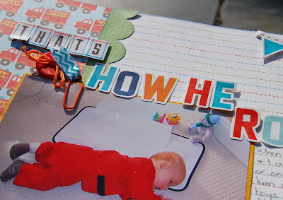
This first one was fairly quick and easy using both sides of 1 sheet of paper (the fire engines and the ruled lines). I cut the paper about a third in from the edge and then stuck both pieces to a piece of cardstock. Use a sheet of card that you don't like or is damaged!  It gives the layout some stability and makes sure everything stays true to 12x12!!

I was really lucky to catch my baby boy doing his first roll over at 4 months old. I had the camera out to take a picture of him in his little fireman's uniform when he just happened to roll over! I couldn't resist using the lovely fire engines paper!!


I used some pop dots to give height to some of the stickers and added a couple of buttons, a paper clip and some ribbon.


How about something on black for some contrast to those bright colours? 
 
This layout was made when I had completed most of the others so  I decided to use up some of the scrap paper panels to make a messy layered stack. I love how the vibrant colours really pop on the black background the same way the black does on the baby mat.


I used my Cameo to cut the title which refers to the mat being a present from an Aunt in New Zealand that we have never met. She made it all by hand and sent it over in time for his birth and left a space for us to record the birth details.


I journalled around the edge in white gel pen and added a few red cross stitches to give texture and to refer to the hand stitching in the story.


Even though quite a few of the papers are aimed at little people, there is a lot of variety in the pack, especially with the B sides. I used 2 of the more generic pieces for my layout featuring my little girl wearing aqua and orange which matched the orange paper nicely.


I die cut my title and the heart background from a template by Daniela Dobson and used the hearts as a mask on the kraft background with Mr Huey's white mist. I used a few bits and bobs from my stash and then outlined the title and the hearts with a white gel pen. I love the subtle effect of kraft on kraft and kraft on orange.


I'll be back soon to show you a few more Scoot projects!
 
Have a wonderful day!
 
Lisa-Jane x
 
Visit Lisa-Jane's blog: Come inside My Crazy Head!