Saturday 10 May 2014

A "Grid" Layout with Hello Sunshine

Recently I ran a workshop at the Wilton Crop. 
We used the lovely Pink Paislee "Hello Sunshine" Papers and a selection of journal cards from Pink Paislee and Simple Stories with a focus on a grid design to create a quick layout for multiple photos.

Here's the layout and instructions should you wish to make a similar page.


Start off by "gutting" the sheet of "Hello Sunshine" paper and saving the middle piece for use on another layout. Of course, you can use a different patterned paper if you wish. Next, trim half an inch off two sides of the white cardstock so that there is a small border of stripes showing when the cardstock is adhered centrally on top of the paper.


Decide which 3" x 4" journal cards to use and crop the photos to size (if you've not already printed them to the size you want) and work out where they will all go in your grid design before starting to stick anything down. 

On my layout I had two rows of 4" high but the top row was only 3" high - this allows for a small border around the layout. You could put a 3" high row in the middle instead but it worked better for my photos and cards to have this arrangement.


You will see from the above photo that I opted to use a 6" x 4" photograph instead of two small photos or you could have 1 small photo and 1 journal card in that space instead. You can choose which ever arrangement suits your photos and the cards you wish to use.

Before sticking everything in place I rounded the corners using a Project Life Corner Rounder and also popped a doilie (cut in half) under the photos/cards each side to add some extra interest.


Add your title - this doesn't have to be in the top centre space - originally I was going to put it in the centre spot but then decided to swap it with the photo.

I chose the title "Whatever the Weather" as my layout is about how my daughter loves to go to the beach no matter what the weather is like .... even on chilly days she will go in the water and happily play on the beach.

I will add some handwritten journalling to that card with the umbrellas and rainbows on over on the right hand side before putting it away in my album.

All that is left to do is add some embellishments. I used some "Hello Sunshine" chipboard, Simple Stories DIY Boutique Brad, Studio Calico Wood heart and arrow and cut the black banner and little black arrow from scraps of paper using the Project Life Nesting die set.

Add embellishments on top of the doilies and overlapping the edge of the photos to help draw the eye towards your main photo(s)


If you do have a go at making a grid layout, please do leave a link in the comments so I can pop over and see or post your "grid" layout to the S J Crafts facebook Page.

Before I go ... don't forget there's FREE Postage and Packing over at the shop all this weekend when you spend £15 or more!! Offer ends 10am Monday 12 May!

Sarah x

Thursday 8 May 2014

Your Undivided Attention - Part 2

Hello, Lisa-Jane here again!

Welcome back for Part 2 of the series where I'm using Simple Stories Homespun collection, which includes lots of cards to cut apart and use in divided page protectors, to make standard layouts and more. If you missed Part One check it out HERE!

This lovely subtle 12x12 paper has little bits of printed embellishment that do lots of the hard work for you. I used several of the 6x4 cards here to create a messy stack without trying to make the pieces bigger and needing to cover joins and gaps. I made sure that each layer was a good contrast to the previous one and covered up any wording that wasn't relevant etc, so aside from the journaling block the pieces act just like sections of patterned paper and not specific 6x4 cards for 6x4 pockets:


Sometimes the sentiments on the cards go right to the edge like with this journaling block which was fine for my purposes but often there is just a some wording or a printed element that can easily be disguised if it doesn't fit your theme. My title was from the chipboard elements and I added some stickers and brads from the collection, a little doily from my stash and some gorgeous enamel dots and that was all it needed:


This next layout is another example of using the larger panels in their original form and incorporating it as part of the title. This time I added an ampersand and a couple of alpha stickers to add more meaning:


I used the long ruler sticker as a border strip and the little chipboard "Let's Stick Together" was absolutely perfect for this page about my 2 great nephews. In the Homespun collection there are bigger sections as well as the 3x4 and 4x6 cards and I used these to layer up the photograph here. 

There was a cute little border on one which was ideal to use leaving it showing even though the rest of the piece is hidden. It would also have been a great place to add some stitching over the printed stitching if you like that look. If you look for colours and patterns that you want to use instead of looking at the cards as they stand alone, then you can get a lot more versatility out of them!


I punched another pinked circle from a scrap card and added it to a paperclip with a coordinating brad. With the colourful heart paper as a background it didn't need a great deal more than a couple of items from the stickers and chipboard sheets:


Some branding strips and offcuts from other cards that were tucked behind other elements, a couple more stickers and pop dots and we have a fun and cheerful page about 2 funny little chaps.


I hope you've enjoyed these ideas for using the various sections in pieces and as whole elements and there is still not a divided page protector in sight!  

I'll see you soon for the final part of the series for a couple of "off the page" projects.

If you want to get hold of some Simple Stories items in the meantime then check out the selection at SJ Crafts HERE!

Lisa-Jane x

Lisa-Jane regularly allows us a glimpse into her life and her craft room over at her fun blog Inside My Head. Go pay her a visit!


Friday 2 May 2014

May Challenge - Bingo!

Hello and welcome to our May challenge! 

Did you know it's (Inter)National Scrapbooking Day (otherwise known as NSD!) tomorrow on the 3rd of May? Happy National Scrapbooking Day to you, we hope this challenge will give you some inspiration if you are crafting this weekend, and there's a chance to win a small prize if you enter!

Thank you to everyone who took part in our April Challenge, we loved looking at the entries, and we'll announce a few of our favourites and a winner here on the blog soon!

If you haven't seen our challenges so far this year, then here's how it works. Each month throughout 2014 we will set a challenge and we'd love it if you would play along. Each month the challenge will vary - sometimes we'll have a sketch, sometimes a colour palette, a photo inspiration or a "recipe" of stash to use or maybe a technique.

At the end of this post there is "linky tool" for you to link up your challenge entry so we can pop along and see and we will feature a few of our favourite projects next month. 

This time it's a BINGO Challenge!

Here's how to play ...

Select 3 boxes from the grid in a line (horizontal/vertical or diagonal) and include the items or technique in those 3 boxes on your project!

Eg: you may choose Ink, Metal, Bow (diagonal line) .... OR .... Transparent, Metal, Stamp (horizontal) but you couldn't select Transparent, Metal, Torn Paper as they are not next to each other in a line!


Here's some inspiration from the Design Team:

Louise:


 Louise was inspired by the top row of the bingo grid. She used Mr Huey Mist, a border punch across the bottom and a 1" circle punch. All supplies are from the March kit which included lots of the 7 Dots Studio "Illumination" Collection, with the addition of a blue cardstock, file tab, cotton and badge. 


Jenny also used the top row from the bingo grid: ink /mist, border punch, and circles. Her products include Kraft cardDistress ink (Weathered Wood), Glossy Accents, and Stickles.


Lisa-Jane selected the middle row: Transparent - Metal - Stamping 
Her supplies include stamps by Hero Arts, papers, stars, vellum and ephemera pack by Crate Paper Boyz Rule, enamel dots by Studio Calico and kraft cardstock.


Jimjams - for S J Crafts - March Illumination Kit & Insta Word Stickers

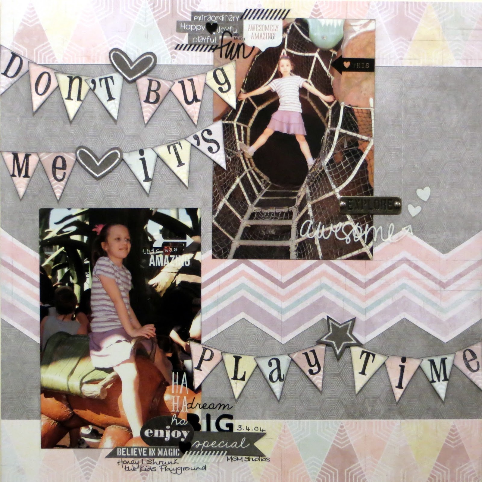
Jemma's page features holiday snaps of her daughter playing in the "Honey, I Shrunk The Kids" playground at Disney! She also chose the middle row:
Transparent stickers from a pack of Simple Stories Insta Clear Word StickersMetal word by Prima, and Stamps from her stash.  

The rest of the supplies are 7 Dots Studio products


Annie went for the middle vertical row and used a border punch, metal embellishment (staples), and torn paper - but in fact she ended up using mixed alphas and circles too, so it could just as well be the diagonal row bottom left to top right!

Her supplies include patterned papers, stickers and diecuts from the 7 Dots Illuminations collection, Studio Calico wood veneersSimple Stories DIY Typeset stickers and Burlap StickersPrima Alphas in black and one of the Prima stitched diecuts from the March kit.   


Jennifer chose a diagonal line from top left to bottom right on the bingo grid (Mist, a Metal Embellishment, a Knot). Her products include Heidi Swapp's Navy Color Shine Mist, Crate Paper's Boys Rule collection Zap & Top Score paper and some Wood Embellishments and Ephemera pieces, and some Studio Calico Cork Stars. Her metal embellies are an old key and some metal rimmed brads, and she has two knots - one in string under the title and one in bakers twine on the key.


We'll have a little mystery prize this month for one entry picked at random from all those who link up! The winner will be announced after the challenge has closed along with a few of our favourites! 

So, will you take up our challenge this month?

Use the linky tool below to add a link to the blog post (or your gallery) with your layout or card and a link back to this post is much appreciated.

You will need to ensure your link is added by the 31st of May (11.59pm).

Enjoy!

Thursday 24 April 2014

One Step Further ... Playing with Patterned Paper!

Hi everyone, Annie here!

Like most scrappers, I love patterned papers and I have piles of the stuff. I can't get enough of it! It's beautiful just as it is, but it's also fun to tweak it a bit to add interest, or to suit a particular project.

Today I'd like to share a few ideas for altering patterned papers to take them one step further ...


This MME Lost & Found Record It! 6x6 paper pad is really gorgeous and so versatile - I've already used some of it to make a valentine for my DH and two pop-out birthday cards for a friend - but I have all of this left and I thought it would be perfect to experiment with.


Here are the results of my experiments with cutting sticking, punching, doodling, embossing, flocking, layering and eyeleting (if that isn't a word, then it should be!) ...


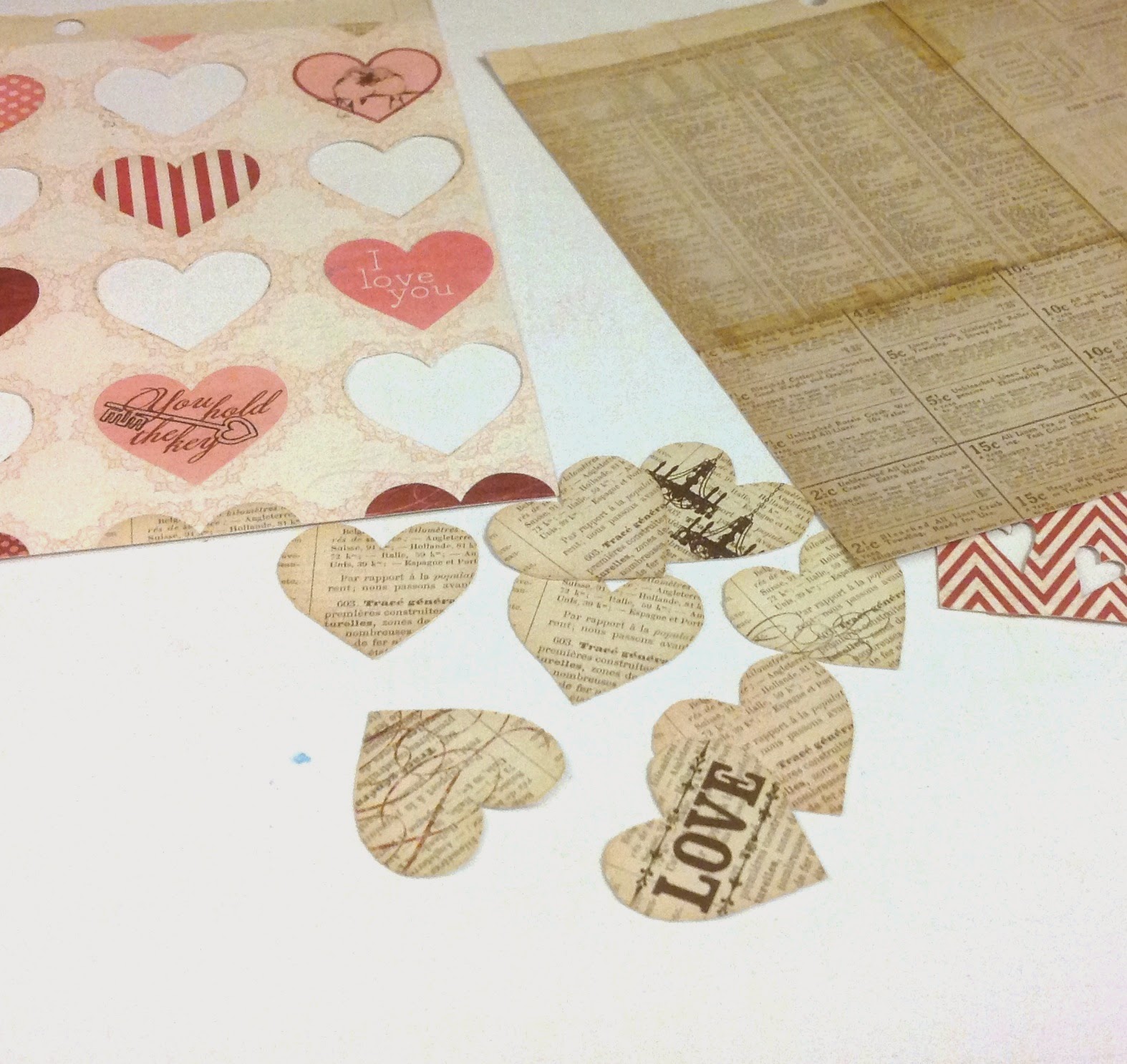
First I took the pretty heart pattern ...


... I cut a few of the hearts from another identical sheet, inked the edges with Distress Inks and adhered them with foam dots to add dimension ...


Then I took these three sheets ...


... I carefully cut out the bookprint hearts, inked the edges and adhered them to the bookprint paper to give extra interest and texture to the background ...


Layering the heart paper over the chevrons paper allowed the pattern to show through the cut-out heart shapes, and I doodled around them with a pencil to add some definition ...


Next, I dug out some eyelets (I can't be the only scrapper who has loads of these lingering in my drawers from years ago!) ...


... and had fun dotting them around to accentuate the spotty patterns ...


Out came my trusty heat gun next, and I used a pearlescent gold embossing powder to enhance some of the stripes ...


It works better with the extra-strong tape and I always burnish it with a bone-folder to make sure it's stuck and help the backing to come off more easily. Here's the result ...


Whilst I had the heat gun out, I did a bit more embossing, using a juicy Sakura pen to add handwriting and doodling to the bookprint background ...


... and then adding embossing powder in a deep shiny lipstick pink ...


I used a gold pen and more embossing to bring some fun textural detail to this lacy pattern ...


Finally, I broke out the flock and used it to create tactile accents ...


I tried a couple of different methods to make the flock stick, and this one seemed to work well. First, I filled in the parts I wanted to accent with the Sakura Glaze pen ...


... then sprinkled with the flock and left it to sit for a while until the pen had dried ...


... then, without shaking off the excess, I folded a sheet of copy paper around it and ran it through my Cuttlebug ...


... then brushed off the excess. This way, the shape stayed well defined and the flock was stuck fast, adding a nice tactile detail to the page ...


These little 6"x6" paper pads are so versatile and you can make them go a really long way. I used my "enhanced" papers to make a couple of scrapbook pages with very different looks ...

Watch:


For this page about my little great-nephew, I added in some chipboard stickers from the MME Chalk Studio Collection and a couple of scraps from the MME Chalk Studio 2 Collection, some Bazzill cardstock and black Prima Canvas Alphas.
I sanded the edges of all the chipboard pieces and used chalk inks to colour them - this is something I often do to make embellishments match my page.

I Love Us:


For this page showing a "double selfie" of me and my DH, I've used small pieces of my patterned paper to form a grid design. The camera is a Simple Stories Daily Grind chipboard sticker - I distressed it and added a button tied with twine to cover the heart motif which was the wrong colour for my page. There is also a cut-apart from the Teresa Collins Daily Stories Collection and I made a couple of embellies from the patterned paper scraps.

Well, after all this I still had loads left in my little paper pad, so I chucked in some more of the Chalk Studio chipboard stickers and four empty toilet rolls ...


... which have been squashed flat overnight for reasons which will become obvious when you see the finished project ...


... a little toilet roll mini book for my niece, with pull-out tags for photos and journaling. These mini books are so much fun to make - you can find loads of tutorials on You Tube.

I hope you will have a go at taking it one step further to give your patterned papers a unique twist and remember to share your results on our FB page!

Thanks for reading my post, see you again soon.

Annie :o)xxx

P.S. If you need more 'One Step Further' inspiration, check out Louise's Stitching and Stamping post HERE!

Annie blogs projects full of beautiful details at her blog Arty Farty Annie. Please pop by and say hello!