Showing posts with label Crate Paper. Show all posts

Tuesday 5 May 2015

One More Selfie Layout

If you are the parent of young teenagers or "tweens" (10-12 year olds) you will, no doubt, know all about the obsession with selfies for this age group!!


For this layout I took inspiration from this layout by Els Brige. Although I loved the banners on Els's layout, they didn't work for me as my photo was slightly larger than hers so I dcided to layer up some 6 x 6 papers from the Crate "Notes and Things" paper pad behind my photo. The diagonal thin striped paper  at the back is still a 6" x 6" sheet but I cut it in half and adhered it with a gap between the two pieces so that the paper would show on both sides of the photo mat.
 
I used a Stampin' up heart stencil to create the hearts on the background cardstock.
 
I loved this photo that my daughter took of herself on her mobile phone whilst out on a family winter walk and couldn't wait to scrap it.


It's a plainer page than I would normally make but I like it as  I think it keeps the focus on the photo.
Have you scrapped selfies that your family have taken of themselves?

Wednesday 22 October 2014

"Our Lovely Girl" Layout

Hello
Sorry for the lack of blog posts lately!
I have been scrapping and have several finished layouts to show you - it's just finding the time to photograph them in decent daylight and upload to the blog that I'm struggling with.

Anyway, here's one that I made a couple of weeks ago at the Artful Angels Crop. I always enjoy going to this crop but it was even better this month as my lovely crafty friend Jennifer Grace came along with me. It was her first visit to the crop and I think she had a fun and productive day and we had a great time scrapping, chatting and catching up. 


I used Crate Boys Rule papers for this layout. I love using collections for different themes other than the one intended by the manufacturer. For example, this collection consists of lots of  traditional "boy" colours and images but it was perfect for this photo of my daughter. Most of the time she is definitely a "Girlie Girl" but at the time this photo was taken she was going through a bit of a "Tom Boy" phase favouring denim shorts or jeans and pumps all the time and even this pose with her hands in her pockets suits the feel of the layout.


The wood arrow is also from the Boys Rule collection and I added the date using some Tim Holtz mini alphas and a sticker and the chipboard heart is by Studio Calico.


I created the title with Black Thickers and a "lovely" sticker. The "You Rock" sticker is matted onto some grey card to match the photo mat and raised up on foam pads.


A few splatters of Heidi Swapp ink to finish and to balance with the title in the opposite corner.

Another finished layout about my girl for her album and not a bit of pink in sight!!

Do you use "Boyish" papers on girl pages or "Girl" papers on boy layouts or do you tend to stick to the theme the papers were intended for?

Thanks for stopping by today!

Tuesday 10 June 2014

Choosing Colours or Themes!!

Hi there, it's Lisa-Jane here today to share some layouts with you.  

When I first started scrapping, I used to look for an exact match to the colours in my photos. This can sometimes be tricky if the clothing or the main colours in the photo don't match the papers you happen to have in your stash at that time. Sometimes matching things too precisely can mean the photo actually ends up getting lost. Similar, but not quite the right shade may just  highlight the difference even more. Not to mention searching through a mountain of stash for just the right shade of blue isn't the best use of time for most scrappers!!
So what should we do .... how do we choose colours for our photos? 

Using themed collections is often a better way to go but it is all too easy to fall into the trap of the theme taking over as you pile on the embellishments and the photo and story can get a little forgotten.

Lately, I've been led more by the story or how I feel about the photos for choosing how to scrap them. I'm no longer limited by the colours in my photos in the way I used to be but I try not to be overly themed either, unless it's Christmas or Halloween and then it's a different story entirely!  I certainly feel more free when choosing papers and pictures to use together than I used to.  

For both of these layouts I've used the fabulous, slightly retro Boys Rule collection.

First of all, let's talk about using colour in the photo as a starting point.  

I find one of the best ways is to pick out one or two from your photo(s) that work well together and then add in additional colours if you need to.  It's also often better to use colours that appear in small amounts in the photos so that it doesn't overpower the layout.


For my double page layout about the beach, I've picked out the yellow t-shirt and an orange hat as my main colours. I used yellow as border strips each side of the photos and there's a some yellow just peeping out of each of the embellishment clusters and the alphas are yellow too.  


I picked out a dark orange cardstock to match the shorts and hat and added a few pops of orange in the embellishments.

I could have tried to match the blues in the sky and the sea or the browns in the stones and used that as my main colours but it is the little people in the photos that I want to draw attention to in my layout.  


I've added a few tiny shells to enhance the beach theme without being over the top. Using a mix of both themed and non-themed embellishments helps highlight the story. The children were having so much fun skimming stones. I wanted to get the fun and carefree feeling of the photos across so a little bit of beach and a little bit of retro fun embellies is perfect.


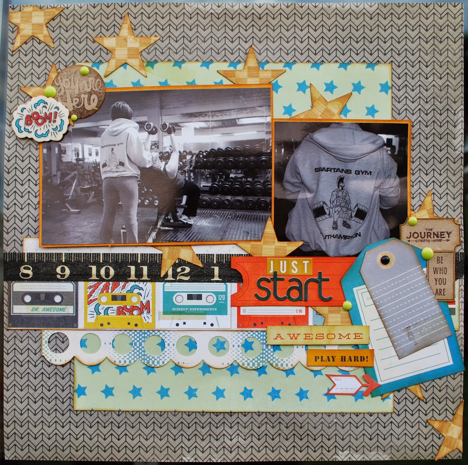
For my next layout, I've turned my photos black and white as I wanted the story behind them to be the main focus.  This page is about me starting my journey with a Personal Trainer and my struggle to get healthy. I knew I wanted a splash of orange because the equipment is orange and including it in the layout reminds me of the equipment.  It doesn't matter that the photos are black and white and don't show the orange paintwork.


 I could have really gone to town with heavily sport or gym themed embellishments but I didn't want to detract from the actual story so  I decided to be more subtle.  I love the retro cassette tape paper so I used a strip of that to remind me of the music that is always blaring.  The tape measure washi tape is a little nod to my size which will hopefully be going down as the journey continues!  The die cut phrases from the ephemera pack are intended for use with little boys but they work with this story so well.


My layout is about the start of my journey and to remind me that this is just the beginning and we have a long way to go.  It doesn't matter what I can't do now or what lays ahead ... what matters is that I have made that all important start.  

I just love that cheeky "Boom" wooden embellishment from the collection!


Do you see that diagonal line across the page of stars - this helps to draw the eye around the photos, over to the title and finally to the journalling.  I used stars for this but other shapes work well too. You could try using circles or hearts in this way.

Boyz Rule is designed with young boys in mind but I've used it for a beach theme and a gym theme! When you are selecting your stash, try to ignore the collection title or the theme the manufacturer has designed for and look carefully at the icons, images and colours in the papers and embelloshments to see how they may work for you. I often use collections for anything other than what the manufacturer intended!

Do you design by colour or theme?  Or do you go for the story first?  What collections have you used for unexpected themes?  

Bye for now
xx

Like the papers LJ used in these layouts? .... They are available to purchase here in the shop!

Lisa-Jane blogs regularly at "Inside My Head" .... her blog is full of family life, scrapbooking, card making and home decor projects!

Thursday 27 March 2014

Mix It Up - Different Collections!

Hi there! Its Lisa-Jane here today with a confession... I'm addicted to patterned paper!  

At the moment I am rather enamoured with Crate Paper and I can tell you that having a bit of a love affair with one particular company can really expand your options when you are making layouts. Because of the printing processes that the companies use, you'll often find that the colours are very similar across collections. I have an album in the making where I am using entirely October Afternoon products from about 10 different collections because they all go so well together and I am really finding that the same is true for Crate Paper.

Take this layout for example: beachy photos made me reach again for The Pier Collection which I am still loving to bits. But I really wanted to bring out the red in that pretty watery floral paper and the red chevron in the collection was too big for what I had in mind.  Instead I reached for a rather unusual option - Bundled Up, the recent Christmas collection! The little red triangles on the cream background were a perfect foil to the prettier piece and the subtle aquas on the reverse went really well too.


I used a few of the Splash Cut Outs, some Simple Stories Homespun alpha stickers and some American Crafts rose trim and everything came together very quickly.


For this next layout I used The Pier again but this time I wanted to really home in on the textures and colours in the photo.  I instantly reached for that glorious turquoise distressed wood paper 'Found' from Maggie Holmes Flea Market as well as adding in a couple of smaller pieces from the Flea Market 6x6 paper pad. 


 Some of the stickers here are from The Pier and I also managed to use a few more of my Simple Stories Homespun stickers too because the layout was about a family of stones that we hid in a crevice on the beach. I definitely made the most of the alpha sheets that came with Homespun as you'll see from another post coming soon!


This final layout merged The Pier with Maggie Holmes Flea Market AND Bundled Up for a very pretty subtle feel. I mounted the Bundled Up ledger paper onto pink Bazzil cardstock, added a strip of Flea Market washed out woodgrain, topped that with some floral from the Flea Market 6x6 pad and then added a couple of scallop border pieces from The Pier to highlight the aqua tones. 


I die cut the title and made the banner from the 6x6 pad too because the smaller print is perfect for these little areas. This gave me lots of room on the ledger paper to tell my story about a picnic we had there a couple of days after the terrorist attacks on the Twin Towers. The photo may be from Christmas but it doesn't stop me scrapping a memory from the past which I don't have a photo of.


Mixing up collections like this gives your layouts a little spark of difference and can really extend the life of those ranges that you might normally only think of for their specific theme. Picking out the colours you want to use and choosing your papers accordingly can really open up new possibilities of coordinating patterns and shows that you really can combine beach and Christmas papers with more generic styles. 

What collections would you use together? We'd love to see!

Bye for now, Lisa-Jane
xx

You can find the Crate Paper products in the S J Crafts Shop by clicking here .... and some of them are REDUCED in the Spring Sale!!

Lisa-Jane blogs lots of scrapbook pages and life stories at her blog Inside My Head - stop by and say hello!

Wednesday 19 March 2014

Very Versatile Vellum

Hello everyone, Jemma here today with my first official DT post!

The *star* of the supplies that I received in my DT package from SJ Crafts really has to be this sheet of starry vellum from Crate Paper's Boys Rule collection. It is just so versatile!

I've already used it to add interest and tone down some brightly coloured stripes on this page:


Which I made for the March Photo Inspiration Challenge ... there's still time to enter and have a chance of a prize too! 

I knew it would also be great to use for a home-made pocket for extra photographs ...

Jimjams - Layout detail - Vellum Pocket - for SJ Crafts

... and for a cute little tag for pulling the photos out of the pocket too.  I couldn't resist using the vellum for another tag tie elsewhere on my page:

Jimjams - layout detail - vellum tag tie - for SJ Crafts

I've squeezed in 10 mini photos (and 4 more in the vellum pocket) but, having trimmed them down a little from the original 3x4, I realised that the cute polaroid frame in the Boys Rule journalling cards pack no longer fitted.  No problem though because I used it as a template to make my own vellum frames:

Jimjams - layout detail - vellum frame - for SJ Crafts

The wonderful thing with a vellum frame is that you can still see the edges of the photo.  The even better thing about making your own frames is that you can have more than one!

Jimjams - Layout - Crazy Characters LHS - for SJ Crafts

That's the left hand side of my double page spread.  Can you spot another use of the starry vellum?

Jimjams - Layout - Crazy Characters RHS - for SJ Crafts

And here's the right hand side.  A busy, busy pair of pages for a character-full few days in Florida in 2004.  Using the pocket also allowed me to hide the two photos containing green costumed creatures as there's no green in the papers I've used (Arcade and Champ):

Jimjams - Layout - Crazy Characters DLO - for SJ Crafts

The addition of wooden elementsstickers and journalling cards added to the business so I had to doodle around the title letters cut from Rad to help them stand out a little more.

I count 5 uses of the vellum ... but my mind is still buzzing with a couple more ... and there's still a small square of my original sheet left, so I'm off to play!

Bye for now, Jemma x

Jemma is one of our newest DT members and she blogs projects full of fabulous ideas at Just Jimjams - please stop by and say hi!

Monday 10 March 2014

Echoing The Weather

Hi there, its Lisa-Jane here today with a layout inspired by the awful weather we had for the start of this year! 

I'm a firm believer in scrapping all aspects of life both good and bad and I wanted to remember the incredible floods and damage that we've had. One of the memories I wanted to capture was a walk we did at Christmas in Wales because when I went back a month later there was substantial damage to the dunes and the sea walls. There had already been one storm a couple of days before we got there and it continued to be very wet and very wind for the whole week making it difficult to get out and about.


I'd been using Crate Paper's The Pier collection for the SJ Crafts March Challenge and I thought it would work really well for this topic too, as it is still beach themed but the water colour design adds to the rain-washed feel. The doily paper ('Cotton Candy') echoes the clouds and I was still able to use lots of the bits of the Splash Cut Outs sheet even though it was nothing to do with swimming in the sunshine!

I added some hessian for texture, which is very on trend this season, and some Enamel Dots to echo the droplets of water everywhere.


Funnily enough, the weather has been quite nice since I did this layout and we've started to see lots of daffodils and crocuses popping up everywhere.  I really hope this is a sign of a turnaround in the wet weather and that the people that have been flooded can get back to normal really soon.

Did you record those dramatic weather patterns in any way?  We'd love to see - leave us a link here or post to our Facebook Page!

Bye for now, Lisa-Jane.

Lisa-Jane shares lots of her gorgeous crafty creations at her blog Inside My Head, go check it out!

Tuesday 4 March 2014

March Challenge - A Photo Collage For Inspiration!

Welcome to our March challenge! 

Thank you to everyone who joined in with the February challenge, it was fabulous to see all the different takes on the sketch & we will show a few of our the entries and announce the winner here on the blog soon!

Here at S J Crafts we love a challenge. Something to take us out of our comfort zone or to encourage us to try something a little different.

Each month throughout the rest of 2014 we will set a challenge and we'd love it if you would play along and take up the challenge. Each month the challenge will vary - sometimes we'll have a sketch, sometimes a colour palette, a photo inspiration or a "recipe" of stash to use or maybe a technique.

At the end of the post there is "linky tool" for you to link up your challenge entry so we can pop along and see and we will feature a few of our favourite projects next month. We really hope lots of you will play along with us and take up the challenge!

For this challenge you need to use the below photo collage as inspiration, in any way you wish.


Your inspiration might be to scrap a photo of a place you love to visit.

Go for a walk at a location near where you live and take photos of your surroundings to make a layout.
Be inspired by the colours : blues, greys, beige, stone, cream.
Scrap  a photo which has no people in it.
Scrap a photo of a beach, sea, sky, clouds, sunset etc
Or you could take "water" as your theme
Or you could use the design of the collage as inspiration for your photo placement.
....or you may have your own idea!!


The wonderful Design Team have created some samples to get your ideas flowing! Here they are:


For Louise the photo collage made her think 'weather', 'blue', and 'clouds'. Her supplies include This Sheet of My Mind's Eye paper, and some Wood Veneers.


The design of the photo collage inspired Annie to make this really quick and simple multi-photo page - her layout has a large 'white space' on the left instead of a large photo, with small photos down the right-hand edge. Annie used the MME Chalk Studio 2 Collection.


Jennifer was inspired to use a photo from the beach, and to use muted colours - with darker colours at the bottom going to lighter 'sky' at the top. Her supplies include some Crate Paper The Pier Paper and Stickers, Prima Canvas Alphas, Jenni Bowlin Tiny Trims Rub Ons, and Simple Stories Chipboard Stickers.


Lisa-Jane was inspired to use wood veneers, woodgrain papers and sandy coloured embellishments to echo the natural textures in the inspiration photos. She also utilised the muted tones of Crate Paper's The Pier collection. 


Jimjams - Layout - Surf's Up! - Crate Paper Boys Rule - SJ Crafts

Jemma was inspired by the water ... to scrap an aquatic activity! She used Crate Paper's Boys Rule which was just the perfect colours for her photos - the papers were Zap,  Top Score, and Vellum Stars, and she used some of the Wood Embellishments and Stickers.


So, will you take up our challenge this month?


Our New Design Team member Annie is kindly offering a prize this month to celebrate joining the S J Crafts team. She will select one person at random from all those who link up to win a small prize!

Use the linky tool below to add a link to the blog post (or your gallery) with your layout or card and a link back to this post is much appreciated.

You will need to ensure your link is added by the 31st of March (11.59pm) and we'll select a few favourites to be featured in a post soon after.

Enjoy x