Friday, 27 June 2014

Holiday Layouts

The weather down here on the south coast has been glorious the last few weeks (although a bit cloudy today!) and the sunshine and warmth reminds me of holidays we've been on and this makes me want scrap my holiday pics!

This photo was from a holiday in Ibiza a few years ago and of course we took a whole load of photos of the scenery and each other but we had none of all 3 of us .... until the very last morning when we stopped for a drink in a little beachside cafe and realising the lack of "Us" photos asked the waitress to take a photo! Selfies weren't so popular then!


I used a sheet of Heidi Swapp Dreams Come True 12 x 12 paper for the background as it has a design similar to sun rays on it which fitted the theme perfectly. I began by layering up a few strips of patterned papers. The red "Life is Beautiful" paper, the little Adventure sticker and the doily sticker behind the journal card are all from Echo Park's Capture Life Collection. 


The title stickers are some old Jenni Bowlin alphas which were just the right red to remind me of the hot sun and matched my t-shirt. I kept the embellishment quite simple with a few more stickers, a resin flower and a "Summer" Flair badge from my stash (sorry I can't remember the brand/collection of some of the embellishments), cork arrows and a cork camera (with a red enamel dot on top), a handful of enamel dots and some drops of Colour Shine gold mist.

Down in the bottom left corner I stamped the little aeroplane and added the date. 

When I'm making a layout, I try to include a whole variety of different textures. So, apart from paper I'll aim to use at least 3 other textures. On this page I have cork, metal (the flair badge), the resin flower, enamel (dots), chipboard (the "live in the sun" embellie is a chip piece!) ink and mist so I think I've acheived (and exceeded) the three textured elements on this page. You could try including lace, ribbon, twine, thread, felt, acetate, vellum, buttons ....

I've also just seen that my daughter's cuddly bunny named Flopsy also sneaked into the photo and as she was her constant companion on the holiday I think I will add another line or two of journalling about Flopsy being in the photo too!!

Do you scrap holiday photos from years gone by when the weather reminds you of that holiday?

Have you ever added extra journalling to a layout after you thought it was all done?!

If you've made a holiday layout recently or included lots of different textures on a recent project or this post inspires you to do so, please do leave a link in the comments so we can stop by and see your work or why not post your layout to our facebook page - we'd love to see it!!


Thursday, 26 June 2014

May Challenge Favourites and a Winner

Hello Everyone!

I'm just popping in to quickly announce the winner of the May Challenge! 

I know it seems ages since the Bingo challenge but sometimes life just gets in the way but here I am at long last to share a few of my favourite entries and tell you who has won a little prize, picked at random from all the entries!

You all seemed to love playing Bingo with lots of you playing along and linking up so it was tricky to pick out my favourites from so many fantastic projects.


Becky used our "Dreamy" monthly kit to create not just one but three fab layouts each using a line of the bingo grid!


Sheena picked the line mist/metal/bow line from the grid and created a beautiful page with lots of layering!


A fun, colourful page by Nathalie with a brilliant journalling idea!

Please do hop on over to these ladies blogs to see their layouts in detail .... and leave them a message whilst you're there ... if you click on their name above the layout it will link you to their blogs!

So onto the winner, picked using random.org

Congratulations to .....No: 17 ... Petrina!!

Petrina entered the challenge via our Facebook page which is always option if you don't have a blog! You can e mail me your project too!

Petrine, please get in touch by e mail to sarah@sjpapercrafts (dot) co (dot) uk with your mailing address so I can get your prize sent.

Thank you to all of you who play along with our challenges .... I love visiting your blogs to see your work ... there's just a few days left to link up for the June Colour Challenge!

Enjoy your day!


Tuesday, 10 June 2014

Choosing Colours or Themes!!

Hi there, it's Lisa-Jane here today to share some layouts with you.  

When I first started scrapping, I used to look for an exact match to the colours in my photos. This can sometimes be tricky if the clothing or the main colours in the photo don't match the papers you happen to have in your stash at that time. Sometimes matching things too precisely can mean the photo actually ends up getting lost. Similar, but not quite the right shade may just  highlight the difference even more. Not to mention searching through a mountain of stash for just the right shade of blue isn't the best use of time for most scrappers!!
So what should we do .... how do we choose colours for our photos? 

Using themed collections is often a better way to go but it is all too easy to fall into the trap of the theme taking over as you pile on the embellishments and the photo and story can get a little forgotten.

Lately, I've been led more by the story or how I feel about the photos for choosing how to scrap them. I'm no longer limited by the colours in my photos in the way I used to be but I try not to be overly themed either, unless it's Christmas or Halloween and then it's a different story entirely!  I certainly feel more free when choosing papers and pictures to use together than I used to.  

For both of these layouts I've used the fabulous, slightly retro Boys Rule collection.

First of all, let's talk about using colour in the photo as a starting point.  

I find one of the best ways is to pick out one or two from your photo(s) that work well together and then add in additional colours if you need to.  It's also often better to use colours that appear in small amounts in the photos so that it doesn't overpower the layout.


For my double page layout about the beach, I've picked out the yellow t-shirt and an orange hat as my main colours. I used yellow as border strips each side of the photos and there's a some yellow just peeping out of each of the embellishment clusters and the alphas are yellow too.  


I picked out a dark orange cardstock to match the shorts and hat and added a few pops of orange in the embellishments.

I could have tried to match the blues in the sky and the sea or the browns in the stones and used that as my main colours but it is the little people in the photos that I want to draw attention to in my layout.  


I've added a few tiny shells to enhance the beach theme without being over the top. Using a mix of both themed and non-themed embellishments helps highlight the story. The children were having so much fun skimming stones. I wanted to get the fun and carefree feeling of the photos across so a little bit of beach and a little bit of retro fun embellies is perfect.


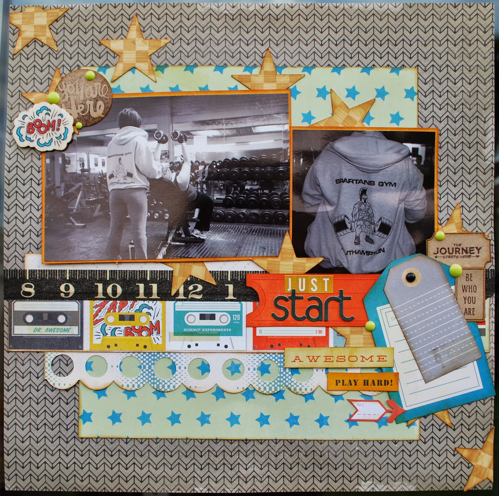
For my next layout, I've turned my photos black and white as I wanted the story behind them to be the main focus.  This page is about me starting my journey with a Personal Trainer and my struggle to get healthy. I knew I wanted a splash of orange because the equipment is orange and including it in the layout reminds me of the equipment.  It doesn't matter that the photos are black and white and don't show the orange paintwork.


 I could have really gone to town with heavily sport or gym themed embellishments but I didn't want to detract from the actual story so  I decided to be more subtle.  I love the retro cassette tape paper so I used a strip of that to remind me of the music that is always blaring.  The tape measure washi tape is a little nod to my size which will hopefully be going down as the journey continues!  The die cut phrases from the ephemera pack are intended for use with little boys but they work with this story so well.


My layout is about the start of my journey and to remind me that this is just the beginning and we have a long way to go.  It doesn't matter what I can't do now or what lays ahead ... what matters is that I have made that all important start.  

I just love that cheeky "Boom" wooden embellishment from the collection!


Do you see that diagonal line across the page of stars - this helps to draw the eye around the photos, over to the title and finally to the journalling.  I used stars for this but other shapes work well too. You could try using circles or hearts in this way.

Boyz Rule is designed with young boys in mind but I've used it for a beach theme and a gym theme! When you are selecting your stash, try to ignore the collection title or the theme the manufacturer has designed for and look carefully at the icons, images and colours in the papers and embelloshments to see how they may work for you. I often use collections for anything other than what the manufacturer intended!

Do you design by colour or theme?  Or do you go for the story first?  What collections have you used for unexpected themes?  

Bye for now
xx

Like the papers LJ used in these layouts? .... They are available to purchase here in the shop!

Lisa-Jane blogs regularly at "Inside My Head" .... her blog is full of family life, scrapbooking, card making and home decor projects!

Wednesday, 4 June 2014

Rain, Rain, Stay And Play!

Using Raindrops for Scrapbook Layouts...

Hello all, Jennifer here today. I'm going to show you different ways to use raindrops on your pages - they aren't just for grey days! I've used lots of the fantastic Pink Paislee Hello Sunshine collection which is so colourful and fun!

The first page I have to show you has a photo that's nothing to do with the rain, it's just a photo of my husband and my daughter when she was 4 months old...

Our Rainbow:


My page is about how we were beginning to get the hang of things by the time she was 4 months old... as much as you can get used to looking after a baby anyway!

To start my layout I began with the 'b' side of the 'Stormy Weather' paper, I picked out some Heidi Swapp Color Shine Mist in 'Coral' and 'Navy', and I pulled out my trusty messy-stuff pizza box:


Then I started sprinkling coral mist at over the paper by taking the lid off the bottle and tapping it so the drops fell off the straw. I concentrated the drops at the top of the paper, so it looked like the beginning of a rain shower::


I let the coral mist dry completely and then repeated this with the navy mist (otherwise the wet colours would blend and look murky):


Once the navy mist was dry too I planned out my page. I couldn't work out why the area on the left didn't look quite right, where I'd placed some Hello Sunshine Ephemera pieces:


Then I realised it was because the right-hand side of the page had a Pocket Card which was mostly white, so I needed to bring the white across the layout... I simply flipped the little raindrops over to their plain white side: 


 Here's how it looked once the page was finished - I stuck the transparent 'be the rainbow' tag from the ephemera down with Glossy Accents which worked a treat:


I loved how there was lots of journaling space on this pocket card:


Of course I couldn't have the word 'rainbow' in the title without making it multicoloured! I didn't have all the colours of the rainbow in my Thickers collection so I just went with what I had:


The next layout does have a photo from a rainy day...

Puddles Without Wellies:


All the other mums at the school-run laugh at my son because he is crazy for puddles... I'm always saying 'no, you haven't got your wellies on' but 5 seconds later he's in there anyway... I've kind of given up!

I chose to let the 'Puddle Jumper' rainy paper work it's magic at the top of my page, it definitely sets the scene, as does the 'Rain Rain Go Away' pocket card. I also added an umbrella from the Puffy Stickers with some drops and Gold Enamel Dots beneath it:


At the left side of the page I used a piece of the 'Rainboots' paper to brighten things up and keep it positive looking! I doodled with a black pen along the white lines to emphasize the arrow effect:


A couple more pieces from the Chipboard Stickers to add to the lighthearted feel - I wanted to show that even though he's ignoring me I don't hold it against him - I just love to see him play:


What do you think? Have I inspired you to add a few raindrops to your next page? I think living in the UK certainly gives us a lot of rainy inspiration!

Have a great day!

Jennifer x

Jennifer blogs her crafting activities over at Jennifer Grace Creates, she has a big blog event coming up on Friday so make sure you check it out!