Wednesday, 4 June 2014

Rain, Rain, Stay And Play!

Using Raindrops for Scrapbook Layouts...

Hello all, Jennifer here today. I'm going to show you different ways to use raindrops on your pages - they aren't just for grey days! I've used lots of the fantastic Pink Paislee Hello Sunshine collection which is so colourful and fun!

The first page I have to show you has a photo that's nothing to do with the rain, it's just a photo of my husband and my daughter when she was 4 months old...

Our Rainbow:


My page is about how we were beginning to get the hang of things by the time she was 4 months old... as much as you can get used to looking after a baby anyway!

To start my layout I began with the 'b' side of the 'Stormy Weather' paper, I picked out some Heidi Swapp Color Shine Mist in 'Coral' and 'Navy', and I pulled out my trusty messy-stuff pizza box:


Then I started sprinkling coral mist at over the paper by taking the lid off the bottle and tapping it so the drops fell off the straw. I concentrated the drops at the top of the paper, so it looked like the beginning of a rain shower::


I let the coral mist dry completely and then repeated this with the navy mist (otherwise the wet colours would blend and look murky):


Once the navy mist was dry too I planned out my page. I couldn't work out why the area on the left didn't look quite right, where I'd placed some Hello Sunshine Ephemera pieces:


Then I realised it was because the right-hand side of the page had a Pocket Card which was mostly white, so I needed to bring the white across the layout... I simply flipped the little raindrops over to their plain white side: 


 Here's how it looked once the page was finished - I stuck the transparent 'be the rainbow' tag from the ephemera down with Glossy Accents which worked a treat:


I loved how there was lots of journaling space on this pocket card:


Of course I couldn't have the word 'rainbow' in the title without making it multicoloured! I didn't have all the colours of the rainbow in my Thickers collection so I just went with what I had:


The next layout does have a photo from a rainy day...

Puddles Without Wellies:


All the other mums at the school-run laugh at my son because he is crazy for puddles... I'm always saying 'no, you haven't got your wellies on' but 5 seconds later he's in there anyway... I've kind of given up!

I chose to let the 'Puddle Jumper' rainy paper work it's magic at the top of my page, it definitely sets the scene, as does the 'Rain Rain Go Away' pocket card. I also added an umbrella from the Puffy Stickers with some drops and Gold Enamel Dots beneath it:


At the left side of the page I used a piece of the 'Rainboots' paper to brighten things up and keep it positive looking! I doodled with a black pen along the white lines to emphasize the arrow effect:


A couple more pieces from the Chipboard Stickers to add to the lighthearted feel - I wanted to show that even though he's ignoring me I don't hold it against him - I just love to see him play:


What do you think? Have I inspired you to add a few raindrops to your next page? I think living in the UK certainly gives us a lot of rainy inspiration!

Have a great day!

Jennifer x

Jennifer blogs her crafting activities over at Jennifer Grace Creates, she has a big blog event coming up on Friday so make sure you check it out!

Monday, 2 June 2014

June Challenge - Summer Colours!

Hello and welcome to our June challenge!

Thank you to everyone who took part in our May Challenge. It's great to see so many of you playing along and we loved looking at the entries. I'll be back here soon to announce a few of our favourites and the winner of the prize.

If you haven't seen our challenges, here's a quick recap of how it works. Each month we will set a challenge and we'd love it if you would play along. Each month the challenge will vary - sometimes we'll have a sketch, sometimes a colour palette, a photo inspiration or a "recipe" of stash to use or maybe a technique.

At the end of this post there is "linky tool" for you to link up your challenge entry so we can pop along and see and we will feature a few of our favourite projects next month. 

June's Challenge is a Colour Palette Challenge!


The colours you must use are: 
  * Hot Pink * Tangerine * Cream * Gold *

The "Cream" can be a neutral of your choice!! So you could use Beige, Grey, White etc!

Here's some inspiration from the S J Crafts Design Team ...


Background - Distress Paints, Distress Inks,Tim Holtz Dot Fade stencil, Heidi Swapp Color Shine. 
Papers - Bazzill cardstockCrate Paper Flea Market 6" pad & bits from my scrap drawer.
Embellies - Buttons, sequins and gems, floss, file tab and arrow made with punches, Spellbinders foliage dies and washi tape.


Jenny has used Picked Raspberry and Spiced Marmalade distress ink from the Mini Distress Ink Pads Kit 1 with a water brush onto cream card to create the background and then stamped the image and sentiment with Versa Mark Watermark Stamp Pad and gold embossing powder, with 3 orange/gold gems to finish off.


Louise has used Simple Stories DIY Boutique collection kit and the
complementary DIY Collection label stickers, some Studio Calico wood veneers, arrows and gold chipboard stars.


Jennifer:


A card from jennifer this month! Supplies included :Amy Tangerine's Plus One 6x6 Pad and a Die-Cut Tag (stitched with gold embroidery thread) , plus some Pink Paislee Hello Sunshine Ephemera and some Studio Calico Gold Stars.


Jemma:


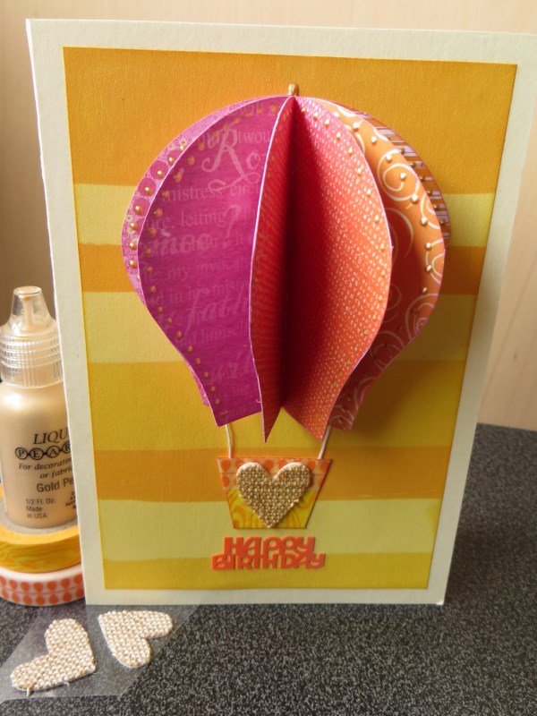
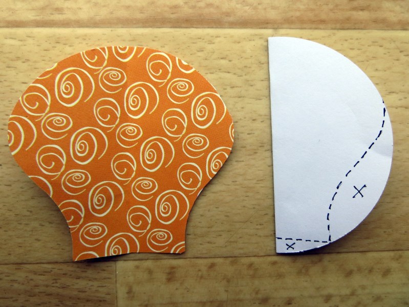
Jemma has used different scraps of patterned paper punched with a 3" circle punch folded in half and trimmed into shape (See below) and added some WRMK orange and yellow washi tape, a Simple Stories burlap heart and Gold Pearl Liquid Pearls.

... and here's how Jemma cut the balloon shape from the circles!


Lisa-Jane


Lisa- Jane has used Echo Park's For The Record collection, MME enamel dots (and some home made ones!), MME chipboard, paper edges inked with Black Soot Distress Ink, ribbon, brads and doily all from her stash.

If you click on the name above the image of the DT project it will take you to their blog. the team work hard to visit every entry so if you could take a minute to pop over to their blogs and leave them a comment I know they would really appreciate it! 


Again there is a small prize this month for one entry picked at random from all those who link up! The winner will be announced after the challenge has closed along with a few of our favourites! 

So, are you up for a colour challenge?

Use the linky tool below to add a link to the blog post (or your gallery) to enter your project. A link back to this post is much appreciated. Projects can also be added to our Facebook Page!

You will need to ensure your link is added by the 30th June 2014 (11.59pm).

Have fun!

Thursday, 29 May 2014

Tags Bursting With Colour and Tim Holtz Techniques!

Hello and welcome back to SJ Crafts, it's Louise here today.


Yesterday design team member Annie shared her wonderful wonderful projects and techniques using Tim Holtz products. If you missed that post you can see it right here!

Today I'd like to share with you how I used mine!


I've always admired Tim Holtz's 12 days of Christmas tags and over the years I've purchased a few of his inks and stamps. I've always thought that his products were rather dark and masculine though.... until recently, when SJ Crafts stocked his new mini stackable ink pads.

I get through a lot of ink pads (especially black ones) and most of them don't last long at all. The Tim Holtz distress inks that I've had for years still ink as well as they did on the day I brought them. With this in mind I went for Kit 1 mainly for their vibrancy....and to accompany them the Faded Dot Stencil.

A few evenings after my new inks and stencil arrived I was perusing Pinterest when I came across some Tim Holtz layering videos....Annie shared some links yesterday. I watched with interest... even though I don't have all of the products he uses I took some things with me... for example, making sure each layer is dry before adding another and mixing the ink with a spray of water. I located my heat gun and water spray (note to self...do not leave water in your spray bottle for a long time..ewww!). 

Annie has already given you some detailed step by step techniques... so here's a quick run through mine. 

Blue Tag

1. I started out with some cream card stock, cut into a tag, the faded dot stencil, Peacock Feather Ink and black ink. Using washi tape to hold the stencil in place I took my Blending Tool, black ink and in spiral motions (as Tim demonstrated) rubbed through the stencil.


2. Remembering to dry the layer with my heat tool!

3. Next I dabbed the ink pad to my craft sheet and added a few squirts of nice clean water. Using my blend tool I mixed the two together and added the colour to the tag. Adding the water distresses the ink further giving it a lighter effect.

4. Again I dried the layer. Once the layer was dry I added some stamps using black ink. I did use the blue ink (without watering the ink down) with a scroll stamp and you'll see that the stamped scroll stands out even though its stamped in the same colour.

With each tag after this I tried out something different...


Pink Tag

I stamped and heat embossed a feather image, then added Picked Raspberry Ink through the faded dot stencil. The background Picked Raspberry ink was watered down and added to the card with the blending tool. A text stamp was used along the side of the tag again with the ink pad. A little ribbon, twine and embellie with some machine stitching finished it off nicely.


Orange Tag

This time I stamped the circle images first in Spiced Marmalade Ink, after drying the ink I sprayed a few squirts of water to the Spiced Marmalade Ink that I'd dabbed onto the craft sheet. When added this dries lighter allowing the darker inked image to show through. After the Faded Dot Stencil was placed over the top, used with black ink.


Yellow Tag

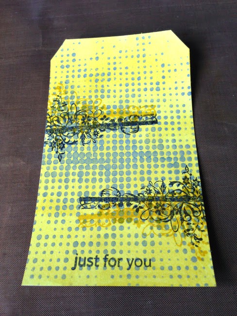
The faded dot stencil was used first this time, with some grey paint. A few dabs of Mustard Seed Ink mixed with water was used with the blending tool to cover the card. I added a stamped floral image, and to finish it off I layered up some papers with a Mustard Seed inked heart wood veneer.


 Here they all are again:


So, are you a fan of Tim Holtz products and techniques?
Please do share your Tim Holtz projects with us either by leaving a comment here on the blog or on our facebook page! 

Don't forget there's now a Ranger / Tim Holtz section in the shop HERE!

Louise x

Louise blogs projects full of intrigue and pops of colour over at Boys, Bugs, and Beautiful Buttons, please pop by and say hi!

Wednesday, 28 May 2014

Checking Out The New Tim Holtz Stencils & Rub-Ons!

Hello everyone, Annie here today to share some ideas and inspiration with you.

I was very excited to open my parcel from SJ Crafts this week, because amongst other things it contained some Tim Holtz goodies and I'm a big TH fan!

In my parcel were two of his Layering Stencils - Dot Fade and Splatters and some Remnant Rubs - Botanical and Life Quotes. There are lots of inspiring vids on YouTube showing you how to achieve some really cool effects with these products, so I was very excited to have a go myself!

After some experimenting I ended up with some seriously inky fingers and this colourful collection of 4"x6" cards and embellishments ...


I used several gorgeous colours of Distress Ink and Distress Paint and a water spritzer - I love the way they all work together. Another essential ingredient not shown here is baby wipes!


Tim said during a demo that the Remnant Rubs will stick to all kinds of things as well as paper, such as wood, glass, metal and fabric, so I wanted to try this out - on the left you can see some wood and metal bits from my rummage drawer, a couple of Ranger Fragments and some canvas fabric to experiment on.

Here are a couple of amazing Tim Holtz demos to give you an idea of what can be done - this one using Remnant Rubs - and this one about the Layering Stencils. I love to watch YouTube videos for ideas and will often have them playing on my iPad whilst I'm scrapping.

For this project, I combined several of the ideas from Tim's demo, adapting slightly to fit what I had available. I started with plain white cardstock and applied matching Distress Paint through the Dot Fade stencil to create a resist background pattern for my first layer ...


Then I added another layer of pattern over this, using two more vibrant colours of Distress Paint and the Splatters stencil ...


Next came the Remnant Rubs - these went on SO easily, because they're REALLY STICKY. You could use them in a "tidier" way if you preferred, but I was going for the messy, grungy style as demonstrated by my hero! This is achieved by rubbing randomly here and there and then quickly snatching the sheet off your project to leave "remnants" of the words and images on your design:


The next layer was created with Distress Inks in Picked Raspberry, Peacock Feathers, Squeezed Lemonade and Orange Marmalade - I love the vibrant colours and the evocative names of these inks ...


A baby wipe swiped over the surface removed ink from the stencilled areas and helped to blend the colours. It's great how the stencilled design keeps its true colour because the paint resists the ink. The other thing you notice at this stage is that despite all the layers you've added, the surface is still totally smooth, so it's perfect for stamping on ...


I used archival ink, so that it wouldn't smudge if I wanted to go back in with more Distress Inks later. Unfortunately the butterfly just didn't work on this card - it stamped perfectly well, but it just didn't look right and I threw it away in a fit of pique and started again :o)


Here's another background - I added Remnant Rubs and stamping to this ...


and repeated the process until I had three cards I was happy with ...


Then it was time to turn my attention to some other types of surfaces ...


The flower was cut twice from canvas fabric using the TH Tattered Florals Bigz Die with my Cuttlebug. I applied the Remnant Rubs before colouring with Distress Ink in Picked Raspberry and Scattered Straw - it was quite difficult to make myself add them truly randomly!

Then I tried some wood and metal - a garden label leftover from our wedding tables and an old front door key, which will both find a home in our wedding album!


I applied the Remnant Rubs to the stick first, then coloured with Distress Inks. I love the way the Rubs act as a resist, so that when you go over the surface with a baby wipe, it blends the colours and leaves a white "halo" around the words and images.

The key got a base coat of Distress Paint in Picket Fence, then I added some Rubs and finished with some Distress Ink in Peacock Feathers around the edges.

One of my favourite home-made embellies is a beer bottle top squished in the Cuttlebug, so that's what I tried next, as well as a Ranger Fragment, just to see how well the Rubs would stick to such a smooth surface ...


The bottle top was treated in much the same way as the key, with a base coat of Distress Paint, followed by some random Rubs and finished with Distress Ink in Scattered Straw and Peacock Feathers.

The Fragment was initially coloured with Alcohol Inks on the back, which looked very pretty, but when I added the Rubs to the front I realised that you couldn't see them very well against the alcohol inked background, so I got the Blending Solution out and removed most of it. Interestingly, although I ended up with the Blending Solution (which is a solvent) all over the place, those Remnant Rubs stayed put, which was pretty impressive - having struggled with rub-ons in the past, I was very impressed with how well and easily these stuck to any surface I tried - just bear in mind that they really are super sticky, so you need to be careful (but that's hardly a negative point!)

What a lovely time I had with these - and I'm stull bursting with ideas to try out! Have you tried Remnant Rubs yet? Do you Love to Layer? Are you a Tim Holtz groupie or a YouTube junkie like me?!

Remember to check out all the Ranger / Tim Holts goodies in the SJ Crafts shop HERE!

Remember to share your projects on our FaceBook page - we love to see what you create!

Cheerio for now
Annie :o)xxx

Annie is often experimenting and sharing her fabulous results over at her blog Arty Farty Annie, go pay her a visit!

P.S. Louise will be here with more Tim Holtz inspiration tomorrow!