Showing posts with label Jemma. Show all posts

Friday, 2 May 2014

May Challenge - Bingo!

Hello and welcome to our May challenge! 

Did you know it's (Inter)National Scrapbooking Day (otherwise known as NSD!) tomorrow on the 3rd of May? Happy National Scrapbooking Day to you, we hope this challenge will give you some inspiration if you are crafting this weekend, and there's a chance to win a small prize if you enter!

Thank you to everyone who took part in our April Challenge, we loved looking at the entries, and we'll announce a few of our favourites and a winner here on the blog soon!

If you haven't seen our challenges so far this year, then here's how it works. Each month throughout 2014 we will set a challenge and we'd love it if you would play along. Each month the challenge will vary - sometimes we'll have a sketch, sometimes a colour palette, a photo inspiration or a "recipe" of stash to use or maybe a technique.

At the end of this post there is "linky tool" for you to link up your challenge entry so we can pop along and see and we will feature a few of our favourite projects next month. 

This time it's a BINGO Challenge!

Here's how to play ...

Select 3 boxes from the grid in a line (horizontal/vertical or diagonal) and include the items or technique in those 3 boxes on your project!

Eg: you may choose Ink, Metal, Bow (diagonal line) .... OR .... Transparent, Metal, Stamp (horizontal) but you couldn't select Transparent, Metal, Torn Paper as they are not next to each other in a line!


Here's some inspiration from the Design Team:

Louise:


 Louise was inspired by the top row of the bingo grid. She used Mr Huey Mist, a border punch across the bottom and a 1" circle punch. All supplies are from the March kit which included lots of the 7 Dots Studio "Illumination" Collection, with the addition of a blue cardstock, file tab, cotton and badge. 


Jenny also used the top row from the bingo grid: ink /mist, border punch, and circles. Her products include Kraft cardDistress ink (Weathered Wood), Glossy Accents, and Stickles.


Lisa-Jane selected the middle row: Transparent - Metal - Stamping 
Her supplies include stamps by Hero Arts, papers, stars, vellum and ephemera pack by Crate Paper Boyz Rule, enamel dots by Studio Calico and kraft cardstock.


Jimjams - for S J Crafts - March Illumination Kit & Insta Word Stickers

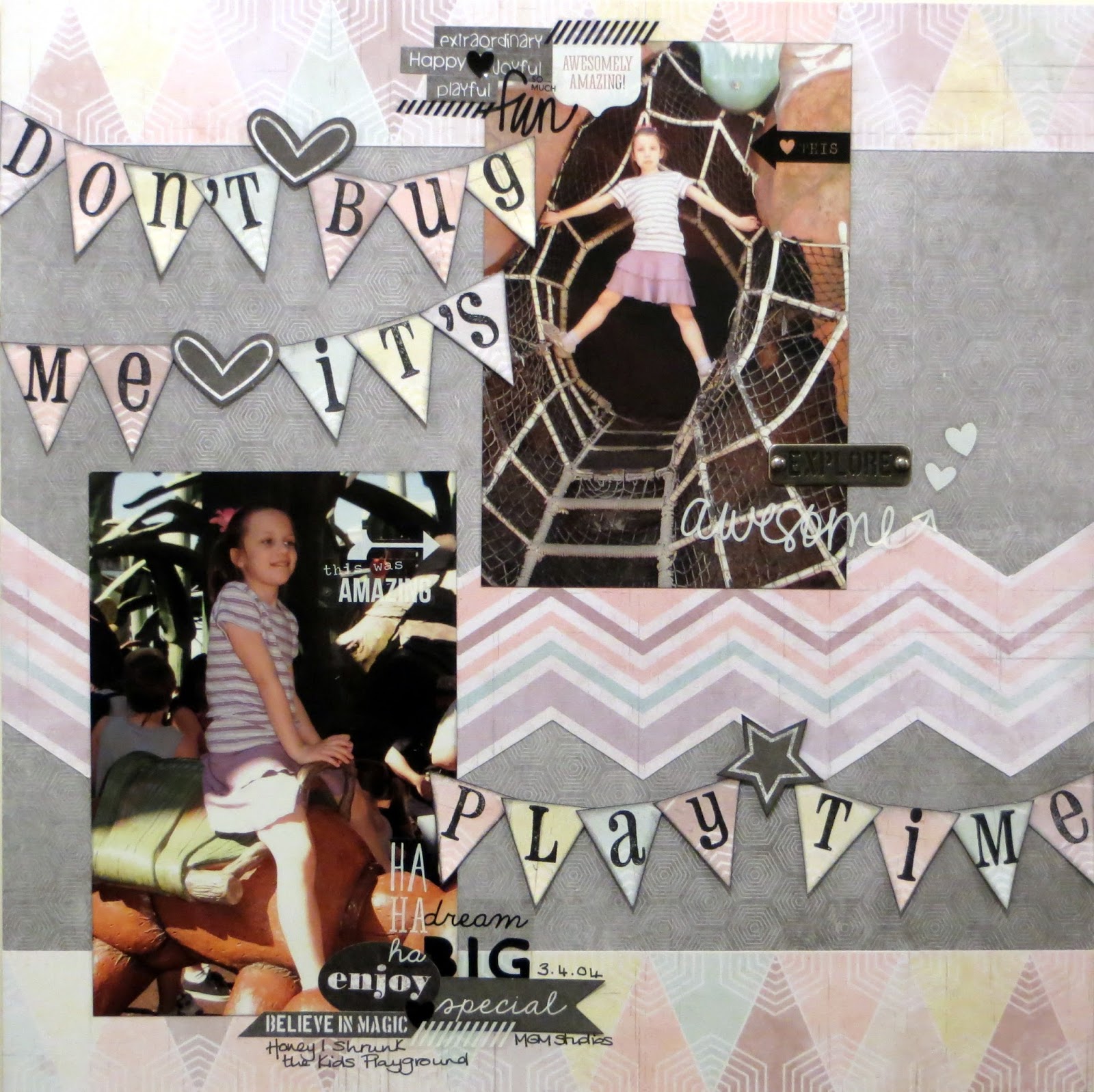
Jemma's page features holiday snaps of her daughter playing in the "Honey, I Shrunk The Kids" playground at Disney! She also chose the middle row:
Transparent stickers from a pack of Simple Stories Insta Clear Word StickersMetal word by Prima, and Stamps from her stash.  

The rest of the supplies are 7 Dots Studio products


Annie went for the middle vertical row and used a border punch, metal embellishment (staples), and torn paper - but in fact she ended up using mixed alphas and circles too, so it could just as well be the diagonal row bottom left to top right!

Her supplies include patterned papers, stickers and diecuts from the 7 Dots Illuminations collection, Studio Calico wood veneersSimple Stories DIY Typeset stickers and Burlap StickersPrima Alphas in black and one of the Prima stitched diecuts from the March kit.   


Jennifer chose a diagonal line from top left to bottom right on the bingo grid (Mist, a Metal Embellishment, a Knot). Her products include Heidi Swapp's Navy Color Shine Mist, Crate Paper's Boys Rule collection Zap & Top Score paper and some Wood Embellishments and Ephemera pieces, and some Studio Calico Cork Stars. Her metal embellies are an old key and some metal rimmed brads, and she has two knots - one in string under the title and one in bakers twine on the key.


We'll have a little mystery prize this month for one entry picked at random from all those who link up! The winner will be announced after the challenge has closed along with a few of our favourites! 

So, will you take up our challenge this month?

Use the linky tool below to add a link to the blog post (or your gallery) with your layout or card and a link back to this post is much appreciated.

You will need to ensure your link is added by the 31st of May (11.59pm).

Enjoy!

Friday, 4 April 2014

Cutting Into A Collection!

Hello everyone, Jemma here today!

Are you a photo-first scrapper? Someone who selects a photo and then chooses just the right papers, cardstock and embellishments to showcase it? Or do you see a paper collection for sale and fall in love with the colours, textures and ephemera, hoping that the perfect photos can be located in your to-scrap pile?

I'm generally in the latter category, partly because there are no bricks & mortar scrapbook shops nearby, meaning that I generally shop online, and partly because I have years of photos to scrap with so it's easier to start with stash that I want to play with.

However making that first cut in the first sheet of paper of a kit or collection is always a little tricky:
Which side of a double-sided sheet should I use?
Would those stripes be better cut vertically or horizontally?
What if the next page's photos needed this paper design?
What if I run out of a favourite pattern?
Here's a look at my Seven Step Process for cutting into a collection; specifically what I did with the Teresa Collins' My Name Is Collection.

Step One - Look at the Collection

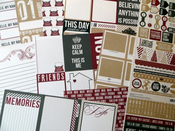
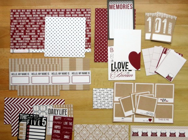
First of all I emptied out all the papers and thought about the sorts of pages I might use them for. Highlights from the A sides included:
• a whole sheet of monthly 3x4 cards for a year-long project
• lots more 4x6 and 3x4 cards with quotes and phrases or space for journalling
• a sheet of 16 fun kraft polaroid frames
• a sheet of words and phrases that could be cut into strips
Teresa Collinns - Hello My Name Is - S J Crafts

Flipping the sheets over, I discovered that there were some versatile background patterns amongst the B sides and realised that I would have to choose which 4x6 or 3x4 cards I definitely wanted to use before cutting up any sheets at all.

Teresa Collinns - Hello My Name Is - S J Crafts

Teresa Collinns - Hello My Name Is - Months - S J Crafts
Step Two - Reserve "Special Sheets"


I'm not a pocket page scrapper but I do like to scrap monthly summaries each year so my first job was to cut up the sheet of calendar cards for this year's album. I'll use these with scraps from the other papers and some of the left-over 4x6 and 3x4 journalling cards. I'm full of admiration for the designer at Teresa Collins - if I had been using divided page protectors the designs are intact on both sides after cutting.

Step Three - Grab Some Photos

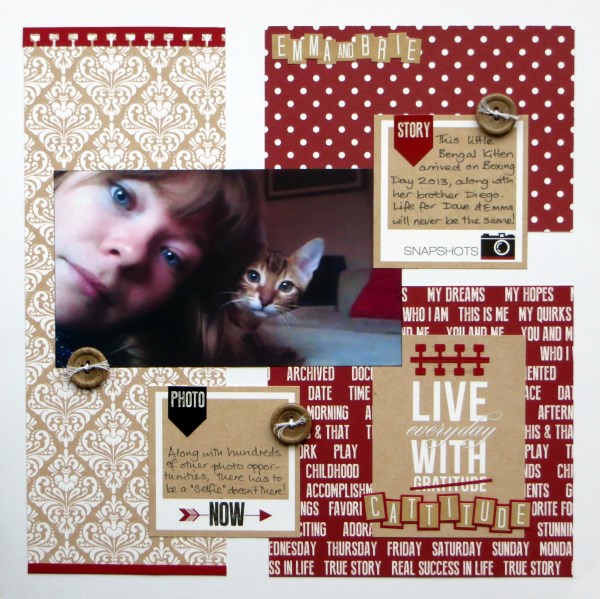
I had two (sets of) photos in mind for these papers by now: a selfie of my son's girlfriend plus kitten, and a set of photos from a visit to a match museum last summer.

Step Four - Extract/Discard Journal Cards

I cut the 'Polaroids' sheet to release my favourites (the B side pattern didn't need any special consideration) and chose 3x4 cards from 'Record' that would work with the photos.  I knew I would never, ever use one of the 4x6 cards from 'Love' ("Don't Forget You Are Awesome") so it was an easy decision to cut it free and use the B side instead.

Teresa Collinns - Hello My Name Is - Polaroids, Record, Love - S J Crafts
Polaroids                        Record                           Love


Step Five - Start Cutting, Shuffling, Sticking

I decided that I would never use the A side of 'Journal' and therefore paid it no attention when cutting the sheet up. Some paper & card shuffling took place before I decided to add a block from the 'Words' paper to to align with the back of the 4x6 card, again paying no heed to the B side as it was a uniform pattern:

Jimjams - Cattitude - for S J Crafts

Teresa Collinns - Hello My Name Is - Noted - S J Crafts
The second set of photos needed a double layout, plenty of "white" space and non-intrusive patterns.  Along with another 'Polaroid' frame, and a 3x4 card from 'Record', I cut two horizontal strips from 'Noted' to stretch across the entire width of my sheets for continuity. Having used/reserved a number of the 3x4 cards from 'Record' I had to be creative with the remainder of the B side and lay short strips of the graph paper just under the photos. It was a real jigsaw!


At this point I did make a mistake and tried to use strips of the kraft ledger paper from 'Tag's before deciding that I hated it and replacing it with strips of red cardstock. No matter though - I need scraps for my monthly pages!


Step Six - See What's Left

OK so that was a single and a double page done and all but one sheet of paper ('Lucky') cut into ... so I cut it up to stop myself being too precious with it!

Teresa Collinns - Hello My Name Is - S J Crafts

Step Seven - Go Back to Step Three & Repeat

Time to take stock and start thinking about the next pages ... my yearly album needs some of those reserved polaroids, journalling cards and scraps, but I'm sure that there's at least one more 12x12 to come ... I'll be back!

Are you tempted to cut into a collection? SJ Crafts stocks a wide range of Collection Kits to play with, check them out!

Jemma x

Jemma blogs at Just Jimjams where she recently celebrate her 400th post, pop over there for more inspiration!

Tuesday, 1 April 2014

April Challenge - A Spring-Time Mood Board!

Hello and welcome to our April challenge!

Thank you to everyone who took part in our March Challenge, we loved looking at the entries, and we'll announce a few of our favourites and a winner here on the blog soon!

If you haven't seen our challenges so far this year, then here's the "scoop" Each month throughout 2014 we will set a challenge and we'd love it if you would play along. Each month the challenge will vary - sometimes we'll have a sketch, sometimes a colour palette, a photo inspiration or a "recipe" of stash to use or maybe a technique.

At the end of this post there is "linky tool" for you to link up your challenge entry so we can pop along and see and we will feature a few of our favourite projects next month.  
There's even a little prize to be won - more on that further down!
We really hope lots of you will play along!

During April we'd love you to take your ideas from this mood board:


Take ideas from this however you choose. You could: 

Use the colours - Yellow, Green, Peach, White, Cork/Kraft
Use the quote 'Look How They Grow' 
Make a page about flowers or plants
Use some of the elements, eg. feathers and stars on your page 
Use the composition somehow (eg. two lines along the base of your project)
Or anything else you get from the mood board!

The SJ Crafts Design Team have created some projects to show what ideas they got from the mood board...


Louise took the composition of the mood board to put together a layout of a (rare) photo of her with her three sons. Her page supplies include the Teresa Collins Family Stories Collection Kitcamera and heart wood veneersenamel dots, and an Amy Tangerine Badge.


Annie was inspired by the mood board to create a pinboard-style page, following the composition and using sticky pearls and enamel dots to "pin" items to the background. To echo the fresh, spring colour palette she used peach/green/yellow/pink - the chalky pastels in the Chalk Studio 2 collection were perfect and contrast beautifully with the Chalk Studio chipboard pieces, frames and stickers. Other elements picked from the mood board added some interest and fun to Annie's page - washi tape, flowers, cork arrows and wood veneer stars. Finally, the quote inspired her journalling!
Jimjams - The Wrong Runes - April Challenge for SJ Crafts

Jemma was inspired by the 3 columns and the colours from the mood board to create a holiday album page.

Jenny:


Jenny was inspired by the colours and some of the elements on the mood board. She has used kraft card, some pretty yellow striped paper from MME Now & Then Mildred pad. Jenny printed her sentiment onto vellum to look like the title on the mood board, and added some paper flowers and adhesive pearls. 


Jennifer mainly took inspiration from the colours, using yellow, lime green, and some cork elements (including the American Crafts Cork Alphas and Arrows), though she swapped the coral hue for a bolder orange from the Amy Tangerine Cut & Paste collection. She also used some feathers, along with some Studio Calico Stars and Enamel Dots!


Taking her inspiration from the colours, gold highlights, the feathers and flowers Lisa-jane created a pretty card for a special girl's birthday. Those enamel dots finish it all off perfectly.

We have a little mystery "Spring themed" prize this month for one entry picked at random from all those who link up! The winner will be announced after the challenge has closed along with a few of our favourites! 

So, will you take up our challenge this month?

Use the linky tool below to add a link to the blog post (or your gallery) with your layout or card and a link back to this post is much appreciated.

You will need to ensure your link is added by the 30th of April (11.59pm).

Enjoy x

Wednesday, 19 March 2014

Very Versatile Vellum

Hello everyone, Jemma here today with my first official DT post!

The *star* of the supplies that I received in my DT package from SJ Crafts really has to be this sheet of starry vellum from Crate Paper's Boys Rule collection. It is just so versatile!

I've already used it to add interest and tone down some brightly coloured stripes on this page:


Which I made for the March Photo Inspiration Challenge ... there's still time to enter and have a chance of a prize too! 

I knew it would also be great to use for a home-made pocket for extra photographs ...

Jimjams - Layout detail - Vellum Pocket - for SJ Crafts

... and for a cute little tag for pulling the photos out of the pocket too.  I couldn't resist using the vellum for another tag tie elsewhere on my page:

Jimjams - layout detail - vellum tag tie - for SJ Crafts

I've squeezed in 10 mini photos (and 4 more in the vellum pocket) but, having trimmed them down a little from the original 3x4, I realised that the cute polaroid frame in the Boys Rule journalling cards pack no longer fitted.  No problem though because I used it as a template to make my own vellum frames:

Jimjams - layout detail - vellum frame - for SJ Crafts

The wonderful thing with a vellum frame is that you can still see the edges of the photo.  The even better thing about making your own frames is that you can have more than one!

Jimjams - Layout - Crazy Characters LHS - for SJ Crafts

That's the left hand side of my double page spread.  Can you spot another use of the starry vellum?

Jimjams - Layout - Crazy Characters RHS - for SJ Crafts

And here's the right hand side.  A busy, busy pair of pages for a character-full few days in Florida in 2004.  Using the pocket also allowed me to hide the two photos containing green costumed creatures as there's no green in the papers I've used (Arcade and Champ):

Jimjams - Layout - Crazy Characters DLO - for SJ Crafts

The addition of wooden elementsstickers and journalling cards added to the business so I had to doodle around the title letters cut from Rad to help them stand out a little more.

I count 5 uses of the vellum ... but my mind is still buzzing with a couple more ... and there's still a small square of my original sheet left, so I'm off to play!

Bye for now, Jemma x

Jemma is one of our newest DT members and she blogs projects full of fabulous ideas at Just Jimjams - please stop by and say hi!

Tuesday, 4 March 2014

March Challenge - A Photo Collage For Inspiration!

Welcome to our March challenge! 

Thank you to everyone who joined in with the February challenge, it was fabulous to see all the different takes on the sketch & we will show a few of our the entries and announce the winner here on the blog soon!

Here at S J Crafts we love a challenge. Something to take us out of our comfort zone or to encourage us to try something a little different.

Each month throughout the rest of 2014 we will set a challenge and we'd love it if you would play along and take up the challenge. Each month the challenge will vary - sometimes we'll have a sketch, sometimes a colour palette, a photo inspiration or a "recipe" of stash to use or maybe a technique.

At the end of the post there is "linky tool" for you to link up your challenge entry so we can pop along and see and we will feature a few of our favourite projects next month. We really hope lots of you will play along with us and take up the challenge!

For this challenge you need to use the below photo collage as inspiration, in any way you wish.


Your inspiration might be to scrap a photo of a place you love to visit.

Go for a walk at a location near where you live and take photos of your surroundings to make a layout.
Be inspired by the colours : blues, greys, beige, stone, cream.
Scrap  a photo which has no people in it.
Scrap a photo of a beach, sea, sky, clouds, sunset etc
Or you could take "water" as your theme
Or you could use the design of the collage as inspiration for your photo placement.
....or you may have your own idea!!


The wonderful Design Team have created some samples to get your ideas flowing! Here they are:


For Louise the photo collage made her think 'weather', 'blue', and 'clouds'. Her supplies include This Sheet of My Mind's Eye paper, and some Wood Veneers.


The design of the photo collage inspired Annie to make this really quick and simple multi-photo page - her layout has a large 'white space' on the left instead of a large photo, with small photos down the right-hand edge. Annie used the MME Chalk Studio 2 Collection.


Jennifer was inspired to use a photo from the beach, and to use muted colours - with darker colours at the bottom going to lighter 'sky' at the top. Her supplies include some Crate Paper The Pier Paper and Stickers, Prima Canvas Alphas, Jenni Bowlin Tiny Trims Rub Ons, and Simple Stories Chipboard Stickers.


Lisa-Jane was inspired to use wood veneers, woodgrain papers and sandy coloured embellishments to echo the natural textures in the inspiration photos. She also utilised the muted tones of Crate Paper's The Pier collection. 


Jimjams - Layout - Surf's Up! - Crate Paper Boys Rule - SJ Crafts

Jemma was inspired by the water ... to scrap an aquatic activity! She used Crate Paper's Boys Rule which was just the perfect colours for her photos - the papers were Zap,  Top Score, and Vellum Stars, and she used some of the Wood Embellishments and Stickers.


So, will you take up our challenge this month?


Our New Design Team member Annie is kindly offering a prize this month to celebrate joining the S J Crafts team. She will select one person at random from all those who link up to win a small prize!

Use the linky tool below to add a link to the blog post (or your gallery) with your layout or card and a link back to this post is much appreciated.

You will need to ensure your link is added by the 31st of March (11.59pm) and we'll select a few favourites to be featured in a post soon after.

Enjoy x

Monday, 3 February 2014

February Challenge - A Sketch!

Welcome to our first challenge of 2014!!

Here at S J Crafts we love a challenge. Something to take us out of our comfort zone or to encourage us to try something a little different.

Each month throughout the rest of 2014 we will set a challenge and we'd love it if you would play along and take up the challenge. Each month the challenge will vary - sometimes we'll have a sketch, sometimes a colour palette, a photo inspiration or a "recipe" of stash to use or maybe a technique.

At the end of the post there is "linky tool" for you to link up your challenge entry so we can pop along and see and we will feature a few of our favourite projects next month. We really hope lots of you will play along with us and take up the challenge!


Our first challenge is a Sketch designed by DT member Jennifer and based on her "Muddy Puddles" scrapbook layout shown below, which was originally featured here!


To get you started here's a few samples from the S J Crafts Design Team:


Louise adapted the sketch to include more photographs. Her supplies included Simple Stories Say Cheese collection.


Jenny used My Minds Eye Cut & Paste 6" x 6" papers and Basic Grey Candy Buttons and shows how a layout sketch can be adapted for a card.


LJ's lovely page tells a great story and uses Echo Park's This and That Graceful collection.


This layout uses Simple Stories Daily Grind, Glitz heart washi tape and a sprinkling of enamel dots.


and from one of our new DT members: 

Annie


Annie's cute layout features Glitz Designs "Wild & Free" collection, some snippets from Simple Stories "Say Cheese" and My Mind's Eye "Chalk Studio" label stickers.


And this fab layout by our other new DT member: 

Jemma


Using Simple Stories (Urban Traveller & 24/Seven) and a few Crate Paper scraps, Jemma has created a super affect by dividing her photo into three sections.


So, will you take up our challenge this month?

Will you increase the photos, rotate it, flip it or stay true to the sketch?

Our New Design Team member Jemma is kindly offering a prize to celebrate joining the S J Crafts team. She will select one person at random from all those who link up to win a small prize!

Use the linky tool below to add a link to the blog post (or gallery) with your layout or card and a link back to this post is much appreciated.

You will need to ensure your link is added by 28th February (11.59pm) and we'll select a few favourites to be featured in a post soon after.

Enjoy x