Thursday, 10 October 2013

Dapper Dan And Vellum!!

Hello everyone!

Louise here today to share with you the new Dapper Dan collection from the wonderful Glitz Designs. When I received my DT pack from Sarah, it struck me that this is a very masculine collection full of bold colours and patterns - perfect for my boys. I pulled together some stamps, embellishments and vellum that I thought would work well with it.

Recently I've joined Instagram and I love collecting everyday photos. I knew that some of photos I'd Instagramed would work perfectly with Dapper Dan. I used my home printer to print the photos I'm sharing today, complete with the instagram effects.

Vellum seems to be coming back into crafting lately so I also want to show you a few ways to incorporate vellum into your scrapbooking.

1. Using vellum to layer and soften

I wanted lots of layers for this photo. It was the start of the rugby season at the beginning of September. Kitted out in his new boots, I wanted to record how long my little man has been playing.

I've used six different patterns from the Dapper Dan pad (some were small pieces of pattern rather than whole 6x6 sheets) with two layers of vellum to soften some of the bold colours and patterns. With one sheet of vellum I punched circles into it to allow the strong colour and pattern to show through.
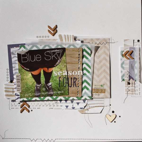


I used stamps to fill in the background gaps. I love this technique, it gives me a chance too, to hook out stamps that I don't use often....or have forgotten I have.

The little woodgrain tiny alphas were perfect for adding the year.

Using all of these layers allowed me to hide my journalling underneath.


2. Using vellum to embellish.

Having to wear a shirt and tie is all part of starting secondary school. The day before my gorgeous man started school he realised he didn't know how to tie a tie, so a quick demonstration with dad and he had it down to a fine art.  Another moment I captured on my phone and instagramed.

The Dapper Dan collection is predominately blue, green and browns. Again I used many patterns on this layout, using shapes cut from scraps.

With this layout I used vellum between the layers of patterned paper and on its own to create an embellished section.

Using a border punch on the edges adds an extra embellished detail.


I journalled onto a tag made from the Dapper Dan patterned paper and tucked it under the layers and photo.


I have another layout and a couple of cards to show you so I hope you'll come back to see that in a day or two!

Have you used vellum lately or does this post make you want to try adding it to a layout?

Louise x

You can see more of Louise's crafting at Boys, Bugs and Beautiful Buttons where she regularly blogs about scrapbooking, card making and life with her boys!!

Supplies used:

Dapper Dan 6 x 6 pad


Sunday, 6 October 2013

October's Six Cards on the 6th!

Hello and welcome to October's Six Card's on the 6th! Do you know it's only 80 days until Christmas?! Sorry to scare you, but it's time to get crafting for the festive season!

This series is all about inspiring you to get those Christmas cards made in time. You can link up your own cards at any time throughout the month, and at the end of the series one link-up from all the posts will win a pizza box stuffed full with scrapbook stash!

If you join in with the series we'd love you to copy this button into your post or sidebar! Just select all the text in the box below the image, and copy that either into a html gadget (or text widget) in your sidebar, or into the html on a blog post. Then the button will appear and will be linked back to the series - your button won't have a box underneath!

 photo Sixon6thbutton200pix_zps673fb713.jpg


Today we have cards by Lisa-Jane and Sarah to make you feel festive!

First up is Lisa-Jane:

I was working with some supplies from the fun new Simple Stories "December Documented" collection:


  This pack included some transparent overlays, which gave me the idea to make some shaker cards! I used the cut apart sheets and stickers to make different backgrounds and foregrounds for my glittery creations. For some finishing touches I added sparkly ribbons and trims and a few snowflake brads from my stash:


Next up is Sarah:

I opted for a red and grey colour scheme this month, using Echo Park's "Reflections Christmas" and Glitz "Hello December" papers. I also added a paper doily to four of the cards - they all have a nice vintage feel: 


Didn't Lisa-Jane and Sarah make some gorgeous cards? It's really not hard to make six cards if you use a common idea for the set. If you are struggling to come up with a 'kit' to make six cards you can always think of a theme like 'vintage' or 'sparkly' to work out what items to pull together!

Now it's your turn! Link up your cards below for a chance to win the pizza box full of stash (prize will go out in early January). We can't wait to see what you create!

Jennifer x

Thursday, 3 October 2013

Chalk Studio Part Two - Timeless Chalkboard!

Hello, Jennifer here with more projects using My Mind's Eye's Chalk Studio collection! Today I want to show you how timeless these chalkboard embellishments are. You can use them for any season, just by changing the papers and other embellishments you put with them! 

The below projects are all cards, but the same techniques can be applied to layouts and other projects.

First up is a card for Halloween. I've been taking my daughter Trick-or-Treating for the last couple of years with a group of mums and kids. One of the other mums (who loves Halloween), is due to have a baby that week, so she won't be coming this year. I'm going to send her this card to make her feel part of it!

Admit One To Spooky Town:


I don't have any Halloween supplies, so I used some orange patterned paper, black and white cardstock, a twirly corner stamp, and the awesome Chalk Studio embellishments to create the spooky feel - the lines surrounding 'Admit One' look almost like bones! 

The word 'spooky' is heat embossed with white embossing powder to give it a ghostly sheen, which is a great texture difference to the chalky label. I finished the card off with a few black pearls and doodled lines around them so they became spiders!

Next is a traditional-looking Christmas card...

Be Good:


The 'Be Good' sentiment on here really stands out with a Chalk Studio Label Sticker backing it. I love the Chipboard Elements banner along the bottom like a ribbon, it looks like the reindeer is jumping across some snowy ground at night-time! I also added a couple of pieces at the top left to resemble icicles. The black chalkboard elements really help the traditional reds and greens to pop from the page!

Finally, here's a card for Valentines Day, though you could use it to send a little love at any time of year...

True Love 4 EVA:


For this card I teamed the Chalk Studio items up with the Glitz Wild & Free 6x6 Pad and Giant Rhinestones. All the hearts were perfect! I amped up the chalkboard on here by layering a Decorative Frame on top of a Label Sticker. The glittery number 4 and the yellow dots made with a pearl pen stop it looking too dark. The 'Well Hello' sentiment adds a cheeky touch that makes me smile!

I'm really loving the chalkboard trend and I know I'm going to be using the embellishments up completely! 

Don't forget these ideas from my two Chalk Studio posts for how to use the embellishments:

  • Frame small photos (you could adhere one with foam dots)
  • Journal onto the Labels using a white gel pen
  • Push some chalkboard items right up to the edge
  • Add colour to the chalkboard
  • Layer a sentiment piece onto another embellishment
  • Heat emboss onto a Label
  • Use a chipboard border like a ribbon
  • Put chalkboard on top of chalkboard!

And if these cards have given you some ideas, you can still join in with our Six Cards on the 6th series to be in with a chance of winning a pizza box filled with stash! There's a couple of days left on the current linky, and a new one will be here on the 6th of October!

Jennifer x

Check out more of Jennifer's layouts and cards at her blog Jennifer Grace Creates.

Monday, 30 September 2013

Chalk Studio Part One - Mix It up!

Hello! It's Jennifer here, with some projects using the My Mind's Eye Chalk Studio collection. The Chipboard Elements, Decorative Frames, and Label Stickers are all available in the shop right now, and I'm going to show you how to mix them up with various papers and embellishments!

First up is a layout made by adding Chalk Studio to some other My Mind's Eye supplies - I've paired them with papers and elements from the Cut & Paste - Charm collection, and the Find Your Wings and Fly - Sky's The Limit collection...

Muddy Puddles:


The chalkboard items add a classic feel to this gallery style page. The small photos I wanted to use could have got lost on a 12x12 page, but the bold style of the frames really helps them stand out. I added bunting from the Chipboard Elements on top of one frame to give it extra depth. The journaling (using a white gel pen) stands out really well too!

The right hand photo frame is adhered to the layout with Foam Dots to make it a focal point, which is also helped by the 'Adventure This Way' arrow from the Carefree Label Sticker Sheet pointing down at the picture:


I also loved using the Chipboard Elements along the edges of the page (you'll spot this on the next layout too), as it defines the edges and brings the page together. If the black items were just in the middle of the page then it would have a heavy centre, so spreading them out like this means you look around the whole page:


I also added lots of Mist splatters and Enamel Dots & Gems to look like raindrops all over the background!

The next page uses a greater mix of products - I used items from Basic Grey Mint Julep, Crate Paper The Pier, and Glitz Designs Wild & Free collections...

So Content:


I've been holding on to this picture for ages - I hadn't scrapped it yet because you can't see my children's faces. But you can see my face, and every time I look at this photo I'm reminded how happy it makes me to have people to play in the sea with - my husband does not like the sea so I've been waiting for my kids to be big enough to join me!

I pulled together an eclectic variety of papers and patterns. They all work together because of the pink and yellow tones, and because the chalkboard scattered around the page helps to unite them.

I added some colours to the top of a couple of pieces using Stickles and Liquid Pearls on one, and Gems on another - don't forget you can alter the chalkboard pieces to fit the theme of your project:


Some of the Chalkboard pieces come with words or a sentiment on them, so if you don't like doing too much journaling then they are perfect for sharing your emotions on the layout. Try layering one on top of another embellishment, like I did with the 'Happy Day' piece here:


I love how the chalkboard elements have helped me to bring an imperfect photo to life!

What do you think about the chalkboard trend? I'm totally loving it, and I'll be back with more Chalk Studio inspiration on a second post soon!

Bye for now, Jennifer x

You can see more of Jennifer's papercrafting at her blog Jennifer Grace Creates!