Showing posts with label Lisa-Jane. Show all posts

Thursday 6 December 2012

Lisa-Jane - Inspired By Winter

Thanks for joining us for the next post in our "Inspired By Winter" series.
If you missed the previous ones you can catch up on those here and here. This week I'd like you to "meet" Design Team member Lisa-Jane.

***    ***    ***

Hello, I'm Lisa-Jane and I'm really pleased to be spending another term on the S J Crafts Design Team!  I have a wonderful husband and I'm a full time Mum to Bella and Louis.  As well as being a total paper-craft addict, I'm also studying Creative Writing part time with the Open University.   


I've always loved cutting and sticking and collecting and telling stories so scrapbooking is the perfect creative outlet for me.  My sister-in-law first introduced me to scrapbooking about 6 years ago but after seeing magazine layouts and the price of basic cardstock, I was too intimated to do any thing more than collect bits and pieces.  A couple of years later, I met someone by chance who was an avid scrapbooker and she tipped my husband off about a local retreat as a Christmas present.  I was exhausted after some rather intensive classes but absolutely hooked!  In the last 3 years I have taken over the house with my papers and embellishments and adhesives!  I think my husband rues the day he surprised me with that ticket!

  • What was your last crafty purchase?  Back last week I bought the new Echo Park Photo Freedom kit for a friend who was wanting to start scrapping.  I'm trying to get lots more friends into it so we can get together more often!  I also treated myself to this gorgeous Glitz washi tape - washi tape is my new love!
  • Who is your favourite Craft Manufacturer?  - and why? My top three are definitely October Afternoon, My Mind's Eye and Echo Park.  October Afternoon have such great interesting designs in really funky colours which are great for children.  I love the versatility of My Mind's Eye with their classic designs and the ability to mix their collections together and they have such beautiful coordinating embellishments.  The winner for me though has to be Echo Park.  Their collections in the last couple of years have been fabulous with stunning papers at a cost effective price in some gorgeous colourways - what's not to love!
  • What is your favourite technique? At the moment I'm really working on my layering technique.  I always ink my edges and sometimes I distress them a bit too.  I love the look of heavily laden pages with lots of little bits and pieces peeking out.  I'll let you into a secret though... using lots of stash on my pages means I can shop for more, right?!

For my "Inspired by Winter" project I created this layout with lots of layers and little sneaks just peeking out.


When I think of Winter I think of cold mornings with pretty patterns of sparkly frosts.  I used doilies to recreate the delicate patterns that the frost leaves on the windows and I used winter colours of white, grey and ice blue, with a hint of sunny yellow.  I sprayed through a doiley with Mister Huey mist and added more Winter sparkle with some white gems and some snowflake patterned vellum to make a little envelope to hide my journalling.
  
My supplies also included: MME Lost and Found 2 6" x 6" pad, stickers from Lost and Found 3 (these two MME collections work so well together), Studio Calico wonderland stickers and Glitz Cashmere Dame washi tape.   

 The Open University year traditionally runs from October to April so the Winter months for me are often spent studying.  Although this photo was taken at my graduation many summers ago, it represents years of being tucked up in the warm with a text book and a highlighter pen. 


With that in mind, I'd better get back to some studying.  


Bye for now
Lisa-Jane xx

Don't forget to stop by Lisa-Jane's blog at Inside My Head

Saturday 1 December 2012

Carta Bella Traditions Scrapbook Layouts


Hi and happy December to you all!

A few days ago we showed you Lisa-Jane's gorgeous cards made with Carta Bella's Traditions collection. Today LJ is back to share with you some scrapbook layouts made with the same collection.

***    ***    ***
One of the things I love about this collection is the mix of traditional and modern and I have used both alongside each other for this scrapbook page.  It was the perfect colour scheme for photos of my friend's little boy at Wisley Gardens a couple of years ago. I think the rich Autumnal colours work so  well with the blue and cream.


The superb quality of these papers meant that it was a breeze to distress the edges with my scissors.  I used plain card stock for my background and a leaf punch to add some scattered details and I raised up some of the stickers on This to That foam dots.


Traditions was also the perfect collection for me to use for our visit to Powderham Castle in Devon.  I have literally packets of photos from our week away leading up to the Jubilee so there will be a fair bit of red, white and blue in my Devon album.   Here I was able to use a lot of red, cream and blue but in a more subtle colour scheme with the hints of green and yellow and cream.


The traditional patterns and muted tones matched well with the historic building and gardens.  Because this particular double layout focuses on the wider extensive grounds, I used floral dies and punches for the embellishments.


I also used garden twine to add texture and a natural border on one side of each page.  A punched border on the other page brings in another of the gorgeous patterns which is then followed through on the flowers.


I fussy cut around the large flowers on one of the papers and added dimension by curling up some of the larger flowers.  There is a lovely sheet of tags included in the kit so I used 3 of them for my journalling area, raising the central one with my writing on.


Traditions is such a versatile collection which lends itself to feminine or masculine, traditional or modern. I can see Carta Bella becoming a firm favourite of mine!

Enjoy your weekend!
Lisa-Jane x

To see more of Lisa-Jane's work please visit her blog: Inside My Head 

Tuesday 27 November 2012

Carta Bella Traditions Cards - By Lisa- Jane


Hi Everyone .... Lisa-Jane here today!

I really enjoyed using the Carta Bella Traditions collection kit.  True to their word, the quality of the papers is amazing.  Carta Bella papers have a lovely subtle texture and are slightly thicker than normal patterned papers.  This collection is ideal if you are after something general to use for everyday, Christmas and Autumn rather than buying a specific themed collection. At first sight it might seem rather vintage but the mix of designs and gorgeous, rich colours enables you to get quite a different feel just by being selective with the patterns.


I had a couple of "Thank You" cards to make and I used this home decor project as inspiration for my butterfly card.  I inked the edges on this one with Rusty Hinge distress ink to echo the Autumnal feel.


For my Dad's birthday card, I made a more traditional card in the true feel of the collection.  I love the blue patterned paper - it is so hard to find "proper" blue scrapbook papers. The vintage car image is stamped and embossed and I some script ribbon finishes it off, complimenting the more traditional style.


There are some wonderful stickers on the sheet that comes in the collection pack and I loved this peacock sticker but I knew it wouldn't work on a scrapbook page for me.  It was the perfect focal point for this card which has a completely different colour-way than the previous two cards.  I used a border punch and some ribbon for texture and layered up the stickers on 3D foam dots. I inked the edges of the paper with Faded Jeans distress ink

I'll be back soon to show you some scrapbook layouts with the same collection kit!
Lisa-Jane x

You can see more of Lisa-Jane's work on her blog: Inside My Head

Monday 27 August 2012

6 x 6 Celebration - Part 3

Hello .... and welcome to the 3rd and final part of my celebration of love for 6x6 paper pads ... I did mention I love them didn't I? ... Yes I thought so!!

Today's project is a cute little mini book project. I wasn't sure what size of book I was going to make until I saw this one by Jen Gallacher.  I used the cut-apart journalling cards from the 12 x 12 sheet in the Everyday Eclectic collection kit as the base and added in some more pages by cutting a few of the 6x6 designs down.  These double sided papers are ideal for mini books and the quality means they are pretty sturdy too.


I used lots of punched shapes throughout the book and I also used up lots of odds and ends from my stash such as sticky ribbons and buttons.


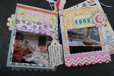
This minibook is about a scrapbooking retreat I went to last year and contains some of my favourite photos from the weekend.


This book is a lasting memory of some of the classes I attended and the projects I made!


I used up lots of odd gems, stickers and brads in the book too - mini books are great stash busters.


I used several different coloured mini-alphabets too similar to these.
  These teeny letters are great to use with mini books and as subtitles or for long titles etc.


I like being able to hang bits off the edges of the pages and make it really eclectic.  Try to mirror facing pages with matching off the page elements to keep continuity through your book.


I used pop dotstwine and lots of ribbons for added interest and texture.


I made a little pocket on the inside of the back page to hold the photos that I wasn't so keen on but still told part of the story.


The back page is made of strips of the different papers which looks great with the strips of different ribbons on the single book ring. Also a great way to use up all those scraps and off cuts!


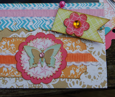
Here are some close ups so you can really see how perfectly the smaller scale on the 6x6 pads works for these little projects.  Lots of lovely layered circular embellishments again and some on trend pennants.


A layered rosette for some dimension which are so easy to make from 6 x 6 papers.


Punched borders work really well on mini books and again the smaller scale makes it easy on the eye.


Little windmills are another embellishment that work so well with 6 x 6 papers - the miniaturised patterns and double sided designs are just perfect.


Mini punched butterflies make the most of every single tiny scrap of the papers and work so well with the denser patterns.  


Layering up different shaped embellishments really gives a sense of dimension without creating too much height in this kind of project.  The other fab thing about the 6x6 papers is that you can run a sheet through your die-cutting machine without having to cut it down to fit - saving time and less waste!!


I hope you can see why I love the versatility of the 6x6 paper pads and I hope that you have enjoyed this little series and seen a few ideas for using your own pads.  
If you have been inspired by anything you've seen in this post, the first part or in Part 2 then we'd love to come and see!

Want to win a prize????  
Well, all you have to do is leave a comment on any of the "6 x 6 Celebration" posts with a link to your own 6 x 6 project and  link up to the S J Crafts blog from your blog post and you'll be entered to win!

Our favourite project will be chosen to win a little prize!!

Your blog post must be dated on or after 24 August (ie the start of this series!)

Closing date for entry is Sunday 16th September!!  Good Luck!!

Lisa-Jane
x

Sunday 26 August 2012

6 x 6 Celebration - Part 2

I hope your Bank Holiday weekend has been good so far!

If you are back for Part 2 of my 6 x 6 celebration, thanks so much for coming back. If you missed Part 1 ... don't worry you can catch up on that right here!

So on to today's 6 x 6 projects ...
again, for most of these projects I have used the Everyday Eclectic collection from Echo Park.

The 6x6 pads are great for making your own embellishments and layering up different sized shapes.  They are perfect to use with punches and diecutting systems because, as mentioned in the Part 1, the scaled down patterns are ideal for smaller shapes.  Layering with different patterns is a breeze when you have a ready coordinated pad.  On this layout, I have used 6 different coordinating patterns on the embellishments but there is no way I would cut into 6 different whole sheets of 12x12.  The chances of me finding 6 coordinating scraps of sufficient size is always a frustrating task too!


I've used a circle, a scalloped circle and a pinked circle and then popped a little embellishment on the top. I inked all the edges in black soot distress ink and made a title with some coordinating stickers.  I like the white space allowing the photo to do the talking, but with the little spots of colour along the circles.


Circles have always been popular but more recently manufacturers are designing papers with layered circles. I tried to create something similar using overlapping circles. I made a similar layout recently in this post using scalloped circles in rows. I used 5 different patterned papers for my circles on my "First Swimming Lesson" layout. I wouldn't have  been brave enough to cut into that many 12 x 12 complete sheets and it would have looked very different with the larger scale prints too.  The 6x6 pads work really well for pieced designs. As well as circles you could try hexagons, or perhaps a quilt design with squares or chevrons with triangles like this tutorial on the EP Blog.


The journalling cards are from the Everyday Eclectic 12x12 collection pack as are some of the stickers and alphabets.  The blue photo mat is also from the 12 x 12 collection - sometimes it works really well to use both sizes on the same layout.  The edges are inked in faded jeans distress ink to emphasis the layers.


I often turn to my 6x6 pads when I want to cut my own title or make my own flowers.  The difference in scale is perfect for creating your own lettering because sometimes the larger prints can make them difficult to read or the pattern gets lost.  Creating coordinating embellishments with the smaller scale alongside larger panels of the full sized sheets really helps to bring a layout together and adds a sense of cohesion.  You don't need to cut into a full sheet to make your embellishments and the smaller scale patterns look better on the smaller pieces - its a win/win situation!!


For this 8.5x11 layout I have mixed up the sizes and used the 6x6 pads for my flowers by layering up different sizes using the Tim Holtz tattered floral die.  I hand cut the CHEF title using a chipboard alphabet as a stencil, and of course I inked all the edges, this time using my vintage photo ink pad.


The sharp eyed among you have probably spotted the trimmings from the quadrant style layout I showed you in Part 1.  The eclectic strip borders work so well with these smaller patterns.  Nothing gets wasted in my craft room and some of these trimmings are actually the top edge of the pad with the hole punched in it because with Echo Park Papers you get the design right up to the gummed edge!


I added a sprinkling of gems and called it done.  I adore the colours in this layout which perfectly matched her cute apron and chefs hat.  I'd forgotten how much I like to hand cut things like this - its a perfect thing to do alongside the children or in front of the television!!

I hope I have given you lots of inspiration for using 6 x 6 paper pads but I've still got more ideas to share in part 3 so be sure to come back for that.

If you feel inspired to make a layout or maybe a card using 6 x 6 papers please do leave a link in the comments so the S J Crafts Design Team can pop by and see.

Also, in Part 3 there will be news of a little prize - so why not go dig out those 6 x 6 pads and make something with them!!

Lisa-Jane
x

Friday 24 August 2012

6 x 6 Celebration - Part 1


Hello, Lisa-Jane here today!
Have I ever told you how much I love 6x6 paper pads? If you already follow my blog you will know I'm rather fond of them. I LOVE them! A lot!

Many people don't realise that these pads are not just quarter sheets but a scaled down version of the 12x12 design.  This makes an incredible difference to how easy they are to use in so many projects and it also makes bolder patterns easier on the eye and less intimidating than on the larger scale.  The miniaturised design gives a denser pattern making them ideal for making coordinating embellishments and die cutting smaller items.

6 x 6 papers with matching 12 x 12 to show scaled down designs!

Cost wise it can work out a great investment too.  The Echo Park Everyday Eclectic Collection that I used contains 24 double sided sheets and is just £6.20!  You get all of the designs in the collection so you don't have to make tricky decisions on which sheets to buy and miss out on any of the gorgeous patterns.  

Cutting into a single sheet of 6x6 is much easier on the heart too - I find I don't squeal like I do when I cut a full sheet of 12x12!  I did all these projects using one pad plus bits from my stash and the coordinating stickers and I still have a few bits left so it is definitely worth it.  I also bought the 12 x 12 collection kit which I love too, and using them together with the 6x6 pad makes them go a LOT further so that's a great reason to purchase both sizes!

So lets have a look at some projects shall we?

One of my favourite ways of using 6x6 pads is in a quadrant design.  You have a ready made coordinating set so just choose 4 designs and you're good to go.  To make a background you can either go overlapping or straight on, and either edge to edge or with a small border as I have here.  I trimmed off half an inch from 2 edges of each piece and stuck them to the corner of a piece of cardstock that I wasn't keen on.  I trimmed the egdes off and I effectively had an 11 inch square of patterned paper.


I gutted a 10 inch square from the middle of a piece of white cardstock so that I could use the inner portion for a photo mat.  This might seem like a palaver but the patterned paper needs something to adhere to and I  don't like wasting cardstock that I know I will use when I have colours and bashed or marked pieces that I don't want on show.  I'm all for using everything and getting the most out of your stash!


Once you have your quadrant background you can build up your layers and embellishments any way you like.  I used a another design from the pad for this layout and then I turned to the 12x12 collection for the journalling card which I made into a pocket.  I also used a 12 x 12 sheet to make the scalloped border in the same pattern as the orange quadrant so that you get the contrast of the 2 patterns but with careful joining or strategically placed embellishments you can make a border from a 6x6 sheet too. Just cut two 6" borders and carefully place together to make a 12" length!


Of course, I haven't ditched my trimmings from the 6x6 papers - I  layered up a couple of little pennant style flags and added a couple of pins and gems.  The rest of those edge trimmings?  You'll see them again in another layout later. 


Of course, lots of people use 6x6 pads for card making and they are absolutely wonderful for that too, again because of their handy size.  I recently made matching tags and cards for my son's teachers for leaving presents.  I wouldn't want to cut into a 12x12 page for a single tag and a couple of little die cuts but using the 6x6 pads make great economical sense here and I can go to town with how many different designs I use.  The pink labels are the reverse of one of the other designs so everything stays perfectly coordinated.


I used pop dots to add dimension on the die cuts and inked all the edges with faded jeans distress ink.

So that's cards/tags and quadrants covered but there are many more ways to get the most from your 6x6 pads, which I'll cover in Parts 2 & 3, so I hope you'll come back for those!

Lisa-Jane
x

Tuesday 1 May 2012

Childish Things!!


Have you seen the gorgeous new collection from Fancy Pants Designs yet?

Childish Things is packed with bright colours and fun designs!

I sent Lisa-Jane the papers, alphas, stickers and buttons to "play with"!! By using some of the bolder designs alongside the plainer "b" sides she has really made the bright designs "work" and I love these layouts.


The title and green gingham border are from the strips paper and LJ used glossy accents on the "dreamer" title to give it shine and dimension. The little blue journalling box is from the cards paper and a few buttons and stickers added to finish.  The heart was collaged with scraps.


Lisa Jane explains ...
One of my favourite papers is the orange woodgrain which marries so wonderfully with the orange and aqua polka dot.  I used my sewing machine to stitch around each block and around the page edge.


Taking inspiration from Glitter Girl's hand-made embellishments and loving the double sided designs on the papers I made my own pin-wheels. I added some brown glitter Thickers, and letter stickers and a few other embellishments from my stash.


For my next page, I knew immediately which story and photo I was going to scrap with these bright and bold papers.  Last Christmas my son got the weekly trophy at football club and the colours and stars on the imagination paper were perfect for this layout.  The alpha stickers in this collection are a good size for titles and there are loads on the sheet with plenty of punctuation marks too.


For the chevrons, I was inspired by this fab tutorial and again used my sewing machine.


I also made a card for my daughter's birthday using the bookshelf paper. I love the bright floral pattern with its bold colours and the cute chipboard piece is from October Afternoon.


This collection may be called Childish Things and it really is great for layouts featuring children of all ages but many of the papers would work equally well for more "grown up" themes.  A lovely, versatile collection that was a real joy to work with.

To see more of LJ's work pop over to her blog here!


Thursday 8 March 2012

Jenni Bowlin Butterflies

Who loves butterflies?!
I don't think I've ever met a scrapbooker or card maker who doesn't love them!
 
Butterflies are one of those timeless embellishments that just seem to always work on a project. Punched butterflies, stamped butterflies or embellished butterflies - so many options!!
 
I sent DT member, Lisa-jane a couple of packs of Jenni Bowlin butterflies!
 
Want to see what she did with them?
 
50th Birthday card - By Lisa-Jane
 A beautiful card for a special birthday!
The JB Butterflies have vellum wings and come decorated with pearls.
Layering them up on punched circles as Lisa-jane has done here is so effective.
 
"WOYWW" Layout - By Lisa-Jane
 
Lisa-jane made a great layout about the fun of joining in with WOYWW, probably the biggest weekly blog hop ever!!
 
 
Using scalloped circle punches and the JB Butterflies, she made a gorgeous banner across the top of the page!

"Let Him Fly" Layout - By Lisa-Jane
Next, Lisa-Jane made a stunning layout about her young son who is growing up so fast. The single photo and three small clusters of embellishments leave plenty of space for the journaling.
The layout background has been misted with tattered angels Glimmer Mist and paint applied with bubble wrap.

Close up of the Jenni Bowlin Blue Butterfly!

Jenni Bowlin Butterflies are available to purchase here!

To see more of Lisa-Jane's work, hop over to her blog.


We will be back soon to show you what Jennifer did with this box!

Have a fabulous day!!